Posts Tagged ‘Philip Palmer’

HELL SHIP reviews — featuring aliens, invaders and pirates in spaaaace!

As we’ve had such a fine crop of reviews for Philip Palmer’s rumbustious tale, we thought it was only fair to share. Click on the following links for more on Hell Ship’s swashbuckling story (UK | ANZ | US ) plus here’s a free extract  and reviews follow below … the Sun review is just hilarious in itself!

No one writes SF quite like Palmer… Hell Ship is a freewheeling extravaganza replete with a hundred varieties of alien, vast spacecraft, exotic worlds… aficionados of bizarre space opera will be amazed and delighted”
GUARDIAN

“The triumphs and tragedies of this novel are told in the style of ancient legend. But there is also a sense of irrepressible fun … This is epic science fiction with a twinkle in its eye”
SUN

“I really do recommend Palmer’s work – he’s an unflinching and relentlessly ballsy writer”
SFREVU.COM

“Great storytelling … a joy to read. Great stuff from Philip which proves why he’s fast becoming my favourite science fiction author”
FALCATA TIMES WEBSITE

“Palmer’s imagination knows no bounds … readable and enjoyable”
THEBOOKBAG.CO.UK

“I knew I would love it after reading just a couple of pages … You will be treated to an entertaining tale of heroics, tragedy and selfless sacrifice all written with a gleam in the eye”
IWILLREADBOOKS.COM

Cover Launch: ARTEMIS by Philip Palmer

Philip Palmer’s Red Claw was one of the first covers I designed when I joined the Orbit team, and it’s still one of my faves. I love working on these covers, they’re so much fun, because his writing has this fabulous pulp scifi feel to it, and you can get that feel with the photo shoots. That’s one of the fun things about establishing a really strong author look, it anchors a book, and let’s you get crazy within that framework. It’s kind of like a mullet—business up front, party in the back! (Yes, I really just compared Book Cover Design to Mullets, call the graphic design police, it’s been a rough week.)

Photographer Laura Hanifin was my partner-in-crime for this cover, which we shot at the same time we shot for Hell Ship and the new e-book cover for Debatable Space. It was an exhausting (and smelly!) shoot, but we got three fantastic cover images out of the day, and you don’t get 3-cover-days very often, trust me!

After the jump, see the whole series of covers together, as well as a teaser!

(more…)

Hell Ship – its maiden voyage

Hell Ship by Philip Palmer (UK | US | ANZ)  is now unleashed, unabashed, unstoppable and available for reading! And it   is in truth a rollercoaster ride featuring adventure at its most adventurous. Look no further than the info below and this free extract to see what we mean:

The Hell Ship hurtles through space. Inside the ship are thousands of slaves, each the last of their race. The Hell Ship and its infernal crew destroyed their homes, slaughtered their families and imprisoned them forever. But one champion refuses to succumb. Sharrock, reduced from hero to captive in one blow, has sworn vengeance. Although Sai-as, head of the alien slave horde, will ruthlessly enforce the status quo. But help is close. Jak has followed the Ship for years and their battles have left Jak broken, a mind in a starship’s body, focussed only on destroying the Ship. Together, can hunter and slave end this interstellar nightmare?

Philip has been kind enough to put up a ‘moodboard‘ of what has influenced his writing journey (a.k.a. time spent exploring space) and will be unveiling further creativity on this site and his blog over the next few weeks. You can also meet the man in person at Orbit’s upcoming London Summer signing on 30th July, so please come along and say hello! (more…)

Somers vs. Palmer – When Authors Collide (Part 4)

So it’s come to this . . . Jeff Somers and Philip Palmer arguing over whose character is better with the laaaaadies.

Again, Philip Palmer has resorted to getting a scientific expert involved – a certain Dr Paul Bostock (according to Phil, a ‘Professor in Protagonism and Genre Conflict at the Heinlein University, Colorado’ – this hasn’t yet been verified).

Ladies – judge for yourself.

(And mind the spoilers if you haven’t read Jeff’s previous 3 books yet!)

Somers vs. Palmer – When Authors Collide (Part 3)

Since we began releasing the footage showing the incendiary events that occured during the filming of a joint promotional video, Jeff Somers has expressed his sheer outrage over the entire episode, and Philip Palmer has published an official ‘apology’ to Jeff here.

Though we are not proud of what has happened, we have decided to continue to release the footage so that the viewing public may come to their own conclusions about the events. In this video, Philip Palmer lists the many, many ways in which his character Version 43 is superior to Avery Cates. Orbit would like to make clear that it does not endorse the behaviour of either author involved in this incident . . .

Somers vs. Palmer – When Authors Collide (Part 1)

Here on Planet Orbit we generally think there’s a pretty good community spirit – both in the office and amongst all our authors out there. But sometimes – just sometimes – those good times go bad. 

Believing Jeff Somers and Philip Palmer to both be “team players” and decent, honourable gentlemen, we thought it might be a good idea to ask them to discuss and compare, in a series of videos, and in a sensible and controlled manner, their newest science fiction titles and their protagonists. But APPARENTLY that wasn’t possible. We’re still going to post the footage – if only to be an example to you all.

Here’s how it all began . . .

Cover Launch: VERSION 43

In book design generally, but especially in sci-fi/fantasy book covers, there’s always a lot of talk about series looks, and sometimes that extends to author looks. Even if an author isn’t writing books in a series, I always attempt to establish a look for them that can tie together all of their books. As a fan, I love it when an author has a really distinctive look, so I can tell it’s a new book by them from a mile away. Yes, I know as a geek AND a designer I do pay more attention to these things, but I think it is safe to say sci-fi/fantasy fans are a design-aware bunch and very much notice these things. I get a little thrill when I see a whole row of books that are recognizably in a unit. That’s why I like to pay attention to spines alot, and try to get as much art (albeit small art) on them as I can.

That is why I am very excited to launch Philip Palmer’s next cover: Version 43. (more…)

Palmer and Cobley are the latest thing …

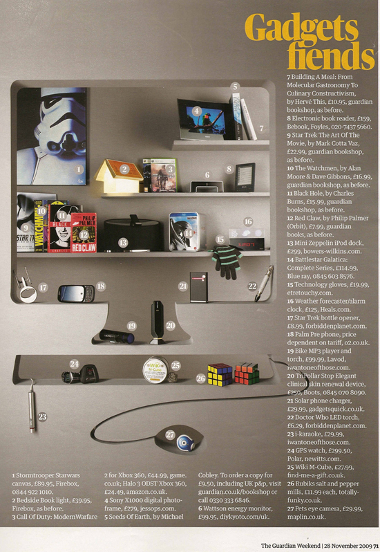
We were delighted to see not just one, but two fabulous Orbit books in the Guardian’s stylish Saturday supplement. The Gadgets Fiends piece presented us with a photograph of the bookshelf of the future, dripping with must-have gadgets, alcohol extraction devices (ahem, fancy bottleopeners) and e-items of various sorts. And although the futuristic bookshelf was rather short on books, we spotted Mike Cobley’s trailblazing Seeds of Earth at no.5 on the legend and Philip Palmer’s explosive Red Claw (UK | US) was a shelf or so below at position 8. Please see the image below for what our future holds …

… after a selected couple of quotes for those books:

For Seeds of Earth:

‘Proper galaxy-spanning Space Opera . . . a worthy addition to the genre’ Iain M. Banks

‘A tightly plotted, action packed epic that leaves you wanting more’ SciFi Now

For Red Claw:

Red Claw is that rare treat, an intelligent action adventure replete with intellectual rigour, human insight and superb storytelling’ – Guardian

‘Philip Palmer has crafted a novel that is brimming with promise… a refreshing and alternative read’ – SciFi Now

Click on the image for a larger and slightly more readable version:

The Guardian Lifestyle, November 28, 2009