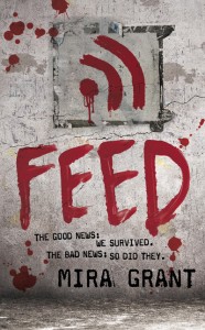
 Winner of officially the hardest cover of the season to nail: Feed by Mira Grant. I don’t want to give too much away on this one, because it’s one of those books that sounds a little odd in the describing, but then blows you away when you read it. There are a lot of layers going on in this book and it’s really smart. It’s an adventure, a political drama, a medical thriller, a character-driven almost first-person memoir style book that sucks you in and you literally cannot put down. And there’s zombies. Yes, a smart book about zombies. But don’t get hung up on the zombie thing. this book is not a joke, or a gimmick. Seriously people, I literally teared up at the end, I got so into the characters. I don’t do that for a lot of science fiction books. (Okay, I cried at the end of Endymion Rising. And Ender’s Game. but that’s it, I swear.)
As I have said before, liking a book a lot before you start designing is a bit of a curse, because you kind of put a lot of pressure on yourself to do a good job. That was definitely the case with Feed, but even worse it was a book that had to combine so many things into a smart package: zombies, politics, blogs, science fiction, horror, and a real world this-could-happen-to-you kind of impact. Tall order. (more…)

 The Unit by Terry DeHart has a pretty straightforward concept: it’s about a family fighting to survive the aftermath of a nuclear apocalypse. It’s a very violent, gritty book, and it reads like an action movie, so we wanted to give the cover a very cinematic look. The “Unit” of the title is a bit of a play on words, as it’s a family unit that must turn itself into a military unit in order to survive. I could go on about the “nuclear” family having to face “nuclear” holocaust but then you’d all groan and go read someone else’s blog post here. (sorry, couldn’t resist)
 Sci-Fi-London
 Winner of officially the hardest cover of the season to nail: Feed by Mira Grant. I don’t want to give too much away on this one, because it’s one of those books that sounds a little odd in the describing, but then blows you away when you read it. There are a lot of layers going on in this book and it’s really smart. It’s an adventure, a political drama, a medical thriller, a character-driven almost first-person memoir style book that sucks you in and you literally cannot put down. And there’s zombies. Yes, a smart book about zombies. But don’t get hung up on the zombie thing. this book is not a joke, or a gimmick. Seriously people, I literally teared up at the end, I got so into the characters. I don’t do that for a lot of science fiction books. (Okay, I cried at the end of Endymion Rising. And Ender’s Game. but that’s it, I swear.)
 One of the best parts—and hardest parts— of my job is getting to match up artists with a new book or series. You have a big responsibility to get the image “right” — there’s nothing worse to me as a fan than reading a book and picturing it in your mind and loving it, then having an image on the cover that just doesn’t capture the depth or feel of the book. This can be true of a cover whether it’s designed or illustrated, but there’s something about an illustration that locks the image of the character or world in your mind, and it’s unshakeable. So you want it to be RIGHT.
 I know you’re all abuzz about the first Alexia Tarabotti novel, Soulless, but I thought I’d fan the flames a bit and introduce the cover for the next book, Changeless by Gail Carriger.
 *warning: contains Monsters! Aliens! and Robots!