New York Book Show 09 Winners!
 The New York Book Show is an annual competition held by the Bookbinders’ Guild of New York, which is a professional publishing organization focusing on design & production of all kinds of trade, academic, and specialty books. It’s one of the few design competitions every year that focuses just on books, and I entered some of our Orbit titles from 2009.
The judging was just completed, and Soulless by Gail Carriger & Tempest Rising by Nicole Peeler both won in the mass market paperback cover design category. Thanks to everyone who was involved in the cover designs, especially Donna Ricci, our model for Alexia Tarabotti & mistress of all things Steampunk Fashion, and Sharon Tancredi, the illustrator for Tempest Rising. Go Team!

 Here’s a brand new Avery Cates novel from author Jeff Somers, book #4: Terminal State. I really liked the
  The Art Department is deep into working on the covers for Fall/Winter 2010-2011 and has moved from deciding directions on books and choosing artists right on to the fun part: photoshoots! Today yours truly was at the studio with the crew responsible for the Jaz Parks series by Jennifer Rardin (hey,
  Now in bite-sized format: the mass market edition of Best Served Cold by Joe Abercrombie. Now even more bad-ass.
 Don’t tell me you haven’t read Tom Holt yet! You love Douglas Adams, read Terry Pratchett, dabble in some A. Lee Martinez, but you haven’t discovered Tom Holt? Well, now is your chance. A huge favorite in the UK, Tom Holt has an impressive backlist of that kind of really funny, smart, and absurdist humor that we all met with the Hitchhiker’s series (way back in what, high school?) and need a pretty steady fix of. I admit I had never been introduced to his books before, but Orbit UK has been publishing him for a long time, and he’s developed quite an underground fan base in the US, who subsist on a diet of imports. This release will be not only the US launch of Tom Holt but also the start of a new cover look for the UK.
 Stealing Fire is another great historical fantasy novel from Jo Graham and another beautiful painting from
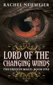
 Today, lucky readers, I have not one but TWO covers to launch: Lord of the Changing Winds and The Land of Burning Sands by Rachel Neumeier,
  The Unit by Terry DeHart has a pretty straightforward concept: it’s about a family fighting to survive the aftermath of a nuclear apocalypse. It’s a very violent, gritty book, and it reads like an action movie, so we wanted to give the cover a very cinematic look. The “Unit” of the title is a bit of a play on words, as it’s a family unit that must turn itself into a military unit in order to survive. I could go on about the “nuclear” family having to face “nuclear” holocaust but then you’d all groan and go read someone else’s blog post here. (sorry, couldn’t resist)
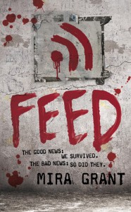
 Winner of officially the hardest cover of the season to nail: Feed by Mira Grant. I don’t want to give too much away on this one, because it’s one of those books that sounds a little odd in the describing, but then blows you away when you read it. There are a lot of layers going on in this book and it’s really smart. It’s an adventure, a political drama, a medical thriller, a character-driven almost first-person memoir style book that sucks you in and you literally cannot put down. And there’s zombies. Yes, a smart book about zombies. But don’t get hung up on the zombie thing. this book is not a joke, or a gimmick. Seriously people, I literally teared up at the end, I got so into the characters. I don’t do that for a lot of science fiction books. (Okay, I cried at the end of Endymion Rising. And Ender’s Game. but that’s it, I swear.)
 One of the best parts—and hardest parts— of my job is getting to match up artists with a new book or series. You have a big responsibility to get the image “right” — there’s nothing worse to me as a fan than reading a book and picturing it in your mind and loving it, then having an image on the cover that just doesn’t capture the depth or feel of the book. This can be true of a cover whether it’s designed or illustrated, but there’s something about an illustration that locks the image of the character or world in your mind, and it’s unshakeable. So you want it to be RIGHT.