A Dance Of Cloaks by David Dalglish, a dark, exciting story featuring fascinating characters & a gritty story http://t.co/F3Gs9SttzP
— Fantasy Book Critic (@FantasyBookCrit) October 4, 2013
The Making of a Cover: Design Roughs
Welcome to the most in-depth, behind-the-scenes, play-by-play account of how a cover is born, from the point of view of the Art Department. We’re charting the conception and birth of the Shadowdance series by David Dalglish.
So far we have talked about the first real step of a book, Acquisition, and then what goes into Cover Briefing. Then we let our minds wander and collect inspiration and form Directions for the cover. Then we agreed on a Photographer and Illustrator. We’ve even found our hero, the Cover Model. And we found a Trampoline for him to do stunt work on safely. We decked him out in book-specific Costume & Props. We spent all day at our Photo Shoot. After receiving the Rough Cuts and narrowing down the images, it was time for the illustrator to get to work, and while he did, Kirk was already working on the Design Roughs.
Kirk Benshoff did the type design for the covers, so I’ll let him take it from here…
Once we’ve decided on what images we want Gene to work on, I need to figure the style of how Gene is going to retouch the images. I also need to work out the layout and type options. This stage of the process can get hectic as I’m trying to figure out more than one thing at one time, so I have a few balls I need juggle.
Especially with a first volume in a series, there are essentially four things needed to establish the look and feel for the cover:
- Image Treatment/Style
- Image Crop
- Layout
- Typography
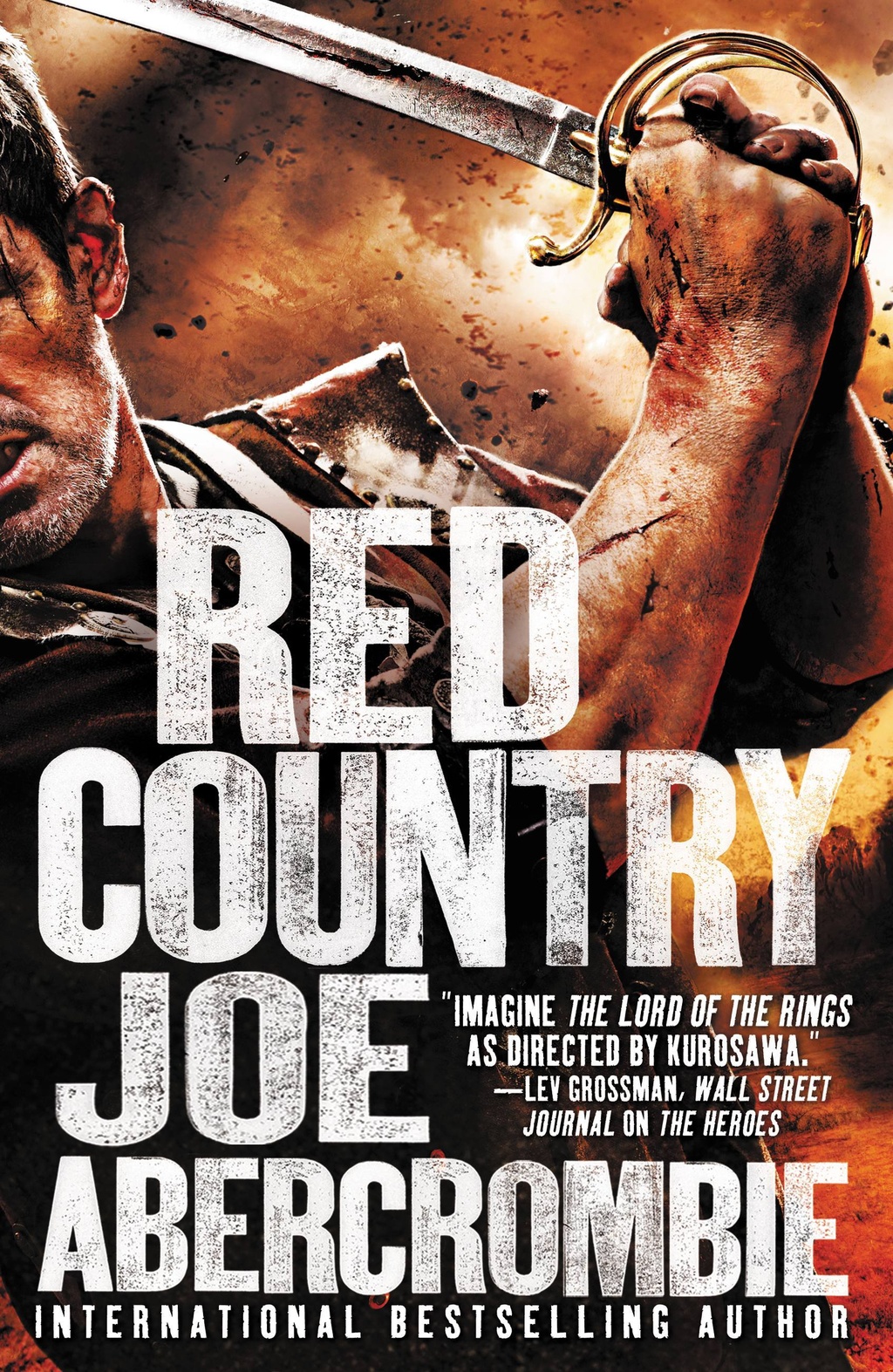
Image Treatment/Style – In other words, we just shot pictures of Bryce as an assassin, but I need the pictures stylized or “Orbit-ize” if you will. We did talk about this in the early concept stages, but now we have images from the photo shoot. I want to explore variations of the initial concept or maybe even an entirely new idea if inspired just to make sure we are getting the look and feel we want. Do we want the final image to look high contrast like the movie poster for Ninja Assassin? Or HDR like the cover for The Heroes by Joe Abercrombie? Do we want the image styled monochromatic, black and white, bright or with a muted color palette? Keep in mind, this is the first book in the series and we can’t change the style later. So we want to be confident with the choice right from the start. Figuring this out is the first item I work on so I can give direction to Gene when I give him the specific photo’s to be retouched.
Here are some of the options I presented internally for the Image/Treatment Style. How did we want the background? How was the art going to be stylized? These are very rough so we can get a knee jerk reaction to a direction.
- Muted Style with a Soft Textured Background
- Saturated Style with a Cracked Background
- Contrasted Style with Smokey Background
- Monochromatic Style with Light Burst Background
- Saturated Style with Solid Color Background
- Contrasted Style with Smokey Background Alternate Color


