Cover Launch: THE BUSINESS OF DEATH by Trent Jamieson
 People often ask me, how do I find artists for books. And there’s never one good answer…I try to stay on top of established scifi and fantasy artists through places like Spectrum and assorted illustration annuals. I also like to keep an eye on people working more in the fine-art and urban art realm thru mags like Juxtapoz and Hi Fructose. I have a long history in comics (yes I was a Comic Shop Girl) and I pull artists across the divide between comics and books. Agents send me updated work from artists constantly. And facebook, believe it or not, has been a great tool for me to find emerging artists.
The real problem isn’t finding good artists, it’s wishing I had enough good projects for all the fabulous artists I know of! And I love getting people who haven’t worked on a lot of book covers to work on a cover for me, I think it keeps the art really fresh. So I am always walking around with a “dream team” list in the back of my head. And David Seidman was on that list for a while…until I heard that we were going to do an omnibus edition of Trent Jamieson’s Deathworks Series, and I knew he would be perfect for it. I’m not sure where I first saw David’s work. It was either on facebook or it was his Coheed and Cambria picture disk. Either way I just had a gut feeling he would have a fabulous take on these books, which is kind of a little Constantine by way of The Office. Or Office Space, actually. We really wanted to capture the bored sick-of-this-damn-cubicle attitude, while showing a bit of the supernatural. If you want to get a good intro you can read the opener here.
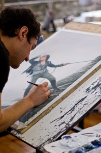
As you’ve been reading over the last few cover posts, I love doing omnibus editions. I like them as a fan, there’s nothing better than getting a big honking bible-sized edition of a series, and as an art director, I love getting a chance to reinvent a character. This redesign started with shooting the right photo reference with Shirley Green. (Often an artist shoots his own reference photo, but the editors and I had such a strong sense of what we wanted that I art directed the shoot then sent the images we picked to David). We had a heck of a time finding the right model. We knew we wanted someone out of the vein of beefcake, someone cool, who could look so very fed up and a bit pissed. And look good in a suit, of course! But we settled on Jonathan Taylor and he was a great model, and totally a geek too, which makes it all so much more fun. Anyway then we picked poses we liked in-house, then sent the winner to David. He & I went back a bunch talking about tone and color, and he produced this fabulous illustration. So enjoy BIG after the jump, along with some shots of the various stages. And a teaser, of course…


 One thing I love about our Orbit roster is our kickass heroines (often written by real-life kickass ladies)…but they’re not JUST kickass. (Ok, not allowed to say “kickass” for the rest of the post, promise.) Our heroines have unique voices and over the course of a series begin to feel utterly real. Sometimes when I am working on covers I literally hear a voice of a character in my head saying yea or nay. Now, I don’t create the art for Nicole Peeler’s Jane True books in the US, but I know illustrator


