Author Archive

The Making of a Cover: Trampoline?

Welcome to the most in-depth, behind-the-scenes, play-by-play account of how a cover is born, from the point of view of the Art Department. We’re charting the conception and birth of the Shadowdance series by David Dalglish.

So far we have talked about the first real step of a book, Acquisitionand then what goes into Cover Briefing. Then we let our minds wander and collect inspiration and form Directions for the cover. Then we agreed on a Photographer and Illustrator. We’ve even found our hero, the Cover Model. Now we tackle some new ground for us: Finding a Trampoline to do aerial stunts.

This is when it’s good to be the Creative Director, because you get to delegate! Art Director Kirk Benshoff had been super excited to figure out how to tackle the stunts that the inventive dance-inspired fighting style would require…and I sent him on a hunt to find not only a trampoline, but a safe place to use it!

After having more than my share of ER visits over the course of my life, I now heed the advice my mom gave me as child to not run in the house with sharp objects. Sometimes it takes a few walks into a wall before you go through the door, and now, I’ve learned that when one “must” run inside with sharp objects; taking the time to find the best place possible is in everyone’s best interest.

In the beginning of planning the Dalglish project, I had three things that were an absolute must: a trampoline, crash mat, and open space. From there I was not going to get persnickety. Getting each individual thing was not necessarily hard, but getting everything together was the challenge. I found a place that rents crash mats, but didn’t deliver and pick-up. I had studio spaces I used in the past, but none had the equipment. I could buy a trampoline, but what do you do with it living in Brooklyn. For the record Lauren TOTALLY wanted me to buy the trampoline and keep it in the office. But I reiterate the various ER visits in my life… so that option was out.

Eventually, I stumbled across a studio in Greenpoint, Brooklyn called Hollywood Stunts NYC. These guys had everything we needed in one location. The stunt studio is located by the East River in Greenpoint inside the old shipping warehouses. Once I walked in I knew this was the place for the photo shoot.

In all seriousness, Gene Mollica usually brings an arsenal of weapons and armor, so he needed space to spread out. Michael Frost needs space for his camera, lights, and backdrops. And we were going have Bryce running with swords and stage blades. Bryce was going to need room to run and having more than one crash mat is never a bad thing. The owner of Hollywood Stunts NYC Bob Cotter was beyond accommodating. And he and his staff you could tell were really into the whole concept of the shoot. After Bryce and I checked the space out, and Bryce nerded out with Bob about stunt work, I knew this was where we were going to have the final shoot. So after a lot of coordination emails, we set the date…

 

The Making of a Cover: Cover Model

Welcome to the most in-depth, behind-the-scenes, play-by-play account of how a cover is born, from the point of view of the Art Department. We’re charting the conception and birth of the Shadowdance series by David Dalglish.
So far we have talked about the first real step of a book, Acquisitionand then what goes into Cover Briefing. Then we let our minds wander and collected inspiration and formed Directions for the cover. Then we agreed on a Photographer and Illustrator. Now we need to find the star of the show, the Cover Model.

I’m going to let Kirk Benshoff tell you all about it, since he’s the one who found our star, and then we’ll hear from Bryce Bermingham, our favorite ninja, who also gave us an in-depth writeup below…

This shoot centered around having a martial artist. I needed someone who could rock a trampoline and execute some back flips, all the while not hurting themselves doing it. I can easily find models; finding a martial artist isn’t as easy as you would think. There aren’t any sites on the interwebs that focus on people who do martial arts for modeling.

I ended up finding someone in the New York City area who does fighting for film and stage, but his specialty was more European sword fighting and I needed someone who knew Eastern fighting styles for jumps/kicks and sword play. I was eventually given the name of Bryce Bermingham, a fight coordinator, stunt coordinator, actor, singer, and dancer who performs martial arts for film and stage.

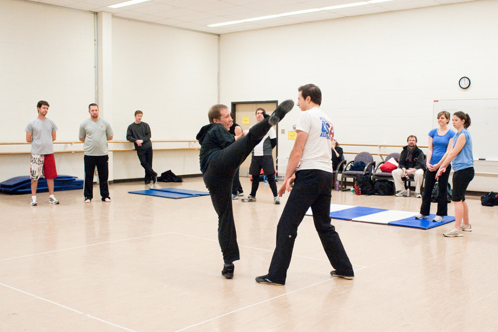
It was funny — one of the first emails I received from Bryce had a picture of him doing a high kick that would have had me bed bound for a month. That picture alone gave me a good sense that this guy knew the fundamentals.

Ultimately Bryce knew exactly what I wanted. He understood the need for theatrics in order to have the “wow” factor in the final illustration. We had a great time going over the project, speaking at length about what I had in mind and what he could bring to the table. Bryce was eager to get into character, too, by reading the books, going with me to check out studios, and offering ideas.

Bryce came up with a “shot list” which is a list of moves we were aiming to capture on film by the end of the shoot day. For a photo shoot that has a lot of parts and potential for things to go wrong, Bryce really gave me a sense of comfort, knowing we were going in with goals. In the end he learned exactly what we wanted and how to do it.

8508043_orig

Now let’s hear from the star of the ninja show himself, Bryce! (more…)

The Making of a Cover: Photographer & Illustrator

Welcome to the most in-depth, behind-the-scenes, play-by-play account of how a cover is born, from the point of view of the Art Department. We’re charting the conception and birth of the Shadowdance series by David Dalglish.

So far we have talked about the first real step of a book, Acquisitionand then what goes into Cover Briefing. Then we let our minds wander and collect inspiration and form Directions for the cover. After a period of brainstorming, it’s time to pick how the art is going to be made, and contact a Photographer and/or Illustrator.

I’m going to let Kirk Benshoff, who was also working on the Art Direction, and would ultimately do the Cover Design, to take it from here:

As I was reading over the cover briefing form in the launch meeting and listing to Devi talk about the Shadowdance series, my mind immediately went to Crouching Tiger, Hidden Dragon. I had this image of the covers showing a martial artist, in mid-move, getting the beauty of the fighting style and in postproduction introducing the brutal and badass.  I felt these books needed to be photographs to give a connection to Haern that illustration wouldn’t have. I want Haern to be alive. I want to see people dressed like him at Comic Con.

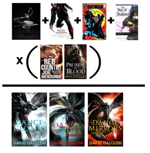
dalglish-covermath-webI did do some research looking for illustrators as well, to show different directions. And even though I had some amazing talent on the docket, I still had the photo shoot on the forefront of my brain. I knew the photo option would be the most badass direction and I also knew it would be an enormous amount more work and expense to pull it all together as well as I could imagine it in my head.

Game on! ;) (more…)

The Making of a Cover: Directions for the Shadowdance Series

Welcome to the most in-depth, behind-the-scenes, play-by-play account of how a cover is born, from the point of view of the Art Department. We’re charting the conception and birth of the Shadowdance series by David Dalglish.
Sorry for a bit of a delay, there, folks. Here in the Art Department we love taking you behind the scenes to see how all he Orbit art comes together, but sometimes we get crazy swamped finishing a season! Time to get caught up! So far we have talked about the first real step of a book, Acquisition, and then what goes into Cover Briefing. Now comes the research part, Directions. When last we left you, Editorial had filled out the Cover Briefing form, and we had all gotten together in a Launch Meeting to talk about what our expectations and plans were for the cover. Now it’s the Art Department’s turn to let it digest in our minds for a little while.

In the meeting we talked about the influence of Brent Weeks’s Night Angel Trilogy, but that’s not enough inspiration. Part of my job at Orbit is keeping tabs on everything going on in the geek world, and art world, that could be used to influence or inspire what goes into our covers. I make sure to know what’s going on with other authors and publishing houses and their new covers. I also keep an eye on “geek” culture at large—movies, television, comics, pop culture. On top of all that it is a major part of my job to keep up on artists and trends happening not only in the SFF world, but also in many genres of illustration, design, photography, even prop-making. Once I get a project like this I let it sit and kind of germinate in the back of my mind for a little while, almost like a lint ball under your bed, gathering mass that might seem random and unrelated, but grows into something little by little. As Creative Director, it’s my job to assign who works on what. I knew this was going to be a huge project, so at this point I approached Art Director Kirk Benshoff about being the Designer for the covers, but also assisting with the idea generation, and then taking point on the Art Direction, whether it ended up being a photo shoot or an illustration. So he started brainstorming as well.

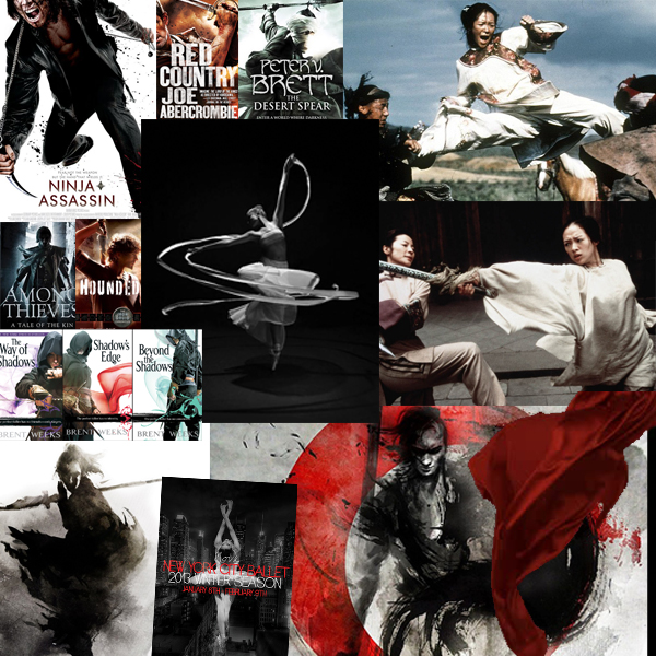
And this random mess below, is kind of a window into what was inspiring us: ninjas, samurai, dramatic dance photography, billowing fabric, brush & ink illustrations, other book covers in the field that had the same kind of drama and energy we were after, beautiful wirework fighting scenes. 

dalglish-inspiration-web


So Kirk and I let this all just come together, and ferment a bit in our minds, never seeing something that exactly fit, just a lot of elements and inspirations…

The Making of a Cover: Cover Briefing the Shadowdance series

coverbrief-pageWelcome to the most in-depth, behind-the-scenes, play-by-play account of how a cover is born, from the point of view of the Art Department. We’re charting the conception and birth of the Shadowdance series by David Dalglish.

So last week we talked about the first real step of a book, Acquisition, which is how a manuscript finds it’s way from the author to the editor, usually via an agent. We’re glossing over a ton of Editorial detail because this is a series about covers, but rest assured, there’s a lot of meetings, discussion, impassioned debate, etc. going on there. I mention it as part of the cover process at all, because, as Devi mentioned, at Orbit, discussing possible cover directions can often help us decide whether or not we are going to try to acquire a new author, series, or book. Very frequently Tim or one of the editors will brainstorm with me about what kind of cover a book they’re thinking of acquiring might have. How would it be different from the other books in the same subgenre at Orbit already? Would it be a chance to do something awesome and push the look of covers in the marketplace? Do I have a gut feeling initially about whether it would have to be photo, or illustration, or design? This can be dangerous because asking me to think about a cover direction is like letting a greyhound out of the starting gate and my brain is halfway down the track before I remind myself that we might not end up buying the book and then I’ll be all disappointed.

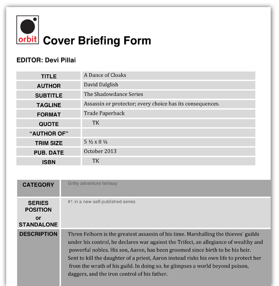
So, because at Orbit we’re all brainstorming on things all the time, Acquisition kind of bleeds into this stage, Cover Briefing. Which is when Art & Editorial have a meeting and Editorial officially tells Art to start working on a cover. Over the years I’ve refined a “Cover Briefing Form” to help Editorial get all of their thoughts down on paper. It’s not so critical that every piece of info is final, it’s more of a jumping-off point for a discussion. For example, if you look at the Cover Briefing Form for the first Shadowdance book, A DANCE OF CLOAKS (US UK | AUS)you’ll see the tagline was different, and we didn’t have a quote yet. But Devi and I had already talked about how we wanted to focus on cloaks and movement and dance, so she already put that in the notes.

Cover Briefing A Dance of Cloaks

We also talk about what the priorities for a cover are – simply put, what things do we want the cover to say, and in what order. Alex Lencicki, our Marketing and Publicity Director also comes to the cover launch, and he contributes greatly in talking about what the target audience for a book would be, what is going on in the rest of the marketplace, what competition would be for this book, etc. For this series we knew we wanted great dynamic action first, we wanted to grab people with the cool factor of the action as our first priority. Target audience was slightly more dominantly male, but not exclusive to female fans. We were looking to please our genre audience, but also attract some action movie fans as well.

Any author input already given to the Editor will be discussed at this stage, and often the Editor and I will talk about what materials I can get started on – do we have a manuscript ready to read? Just a few sample chapters? I also find it really helpful to make sure to check in with the author at the beginning of the cover process, either through the editor or directly with the author. I think Orbit is pretty unique in that I try to keep the authors as much in the loop as possible through the cover process. In SFF, so much is created straight out of the author’s imagination, it’s really helpful to hear world building details and ideas directly from them. Some have even made pinterest inspiration boards that I can look at for inspiration. At this stage I really have no idea what direction we’re going to take, I’m just gathering as much info as I can, to stew on for a little while.

(more…)

The Making of a Cover: Acquisition of the Shadowdance Series

Welcome to the most in-depth, behind-the-scenes, play-by-play account of how a cover is born, from the point of view of the Art Department. We’re charting the conception and birth of the Shadowdance series by David Dalglish. I’ll be your emcee thru the process, with all the important players chiming in. 

Dalglish_originalcovers

The first stage of any book being born is Acquisition, or how an editor comes to find and buy a book to publish. This can happen a few ways, but by far the most common is for an agent to pitch the manuscript to an editor. Agents are a very important part of the publishing process. They’re kind of gatekeepers, coaches, and parents, all rolled up into one. They know the editors working in their genres, and they know what kinds of manuscripts each publishing house is looking for.

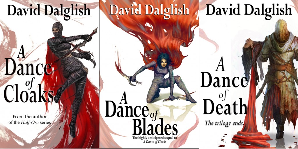
Although I do hear a lot about what goes on in the acquisition process, I’m not officially part of it. A lot of times the editors here will have a chat with me about the book they’re considering, see what I think we can do with the covers, etc. – but for the most part, this is more Editorial’s game, so I’ll let you hear from Devi Pillai, Editorial Director of Orbit, and the author himself, David Dalglish. Before I do, though, keep in mind that this was a slightly different case, as David had self-published the series already. Above you can see the original covers he produced for the first 3 books. We’ll talk in the next post about comparable titles and marketplace considerations, but in general, they’re very nice quality compared to a lot of what I see in the self-published world, so I was happy to be working with an author who had some grasp of what makes a good cover.

FROM DEVI:

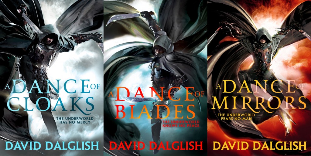
Michael Carr, David’s fantastic agent, sent me an email asking if I was interested in David Dalglish’s Shadowdance series. I, of course, was over the moon to get a chance at working with David and his world. We immediately started the acquisition process which involves considering how we wanted to position the books (which includes the metadata, the covers, etc).  We determined that the books would be better presented as a series versus a trilogy, so we knew we had to change the cover style for all six books. To do this, I brought in Lauren and Kirk from the Art Department to discuss what the cover direction would be. We thought that David’s covers had presence with his existing audience, but with rebranding the series, we wanted to go in a different direction.  We loved the photographic, yet very martial arts look of movies like Hero and Crouching Tiger, Hidden Dragon and thought a cover using Haern’s cloakdance would be the best portrayal of the series.

FROM DAVID:

When I first came up with the idea for A DANCE OF CLOAKS (US | UK | AUS), the book was very much inspired by Brent Weeks’s Night Angel trilogy. Those covers of his, I adored. I studied them a ton, wanting to pick up the subtler things as a way of helping to identify my own books as belonging in a similar vein and genre. I loved the white space, the solitary figure, and the little flourish of color that helped seal it together. And it was those elements I shamelessly ripped off implemented as well. I had a figure upon white background (the faceless woman, Zusa), and it was her deep red cloak that added the flourish of color, as well as a nice artistic over-the-top decoration as it looped around.

Going in, I had a feeling what the new covers would be like, at least in concept. Simply put: they were going to put Haern on the cover. Now I didn’t know if he’d be on all of them like he is now, but I knew he’d be gracing the cover of book one, and most likely be looking badass. Beyond that, I could only cross my fingers and wait to see what Orbit’s art department came up with.

So in one respect, I was curious how Orbit might remain faithful to my original covers, yet not end up duplicating one of their own previous covers. Was it even possible?

Dalglish_ShadowdanceX3_TP

The Making of a Cover in 13 Parts: David Dalglish’s SHADOWDANCE Series

Dalglish_ShadowdanceX3_TP

As you may have seen start to spread across the interwebs, the new Orbit covers for David Dalglish’s Shadowdance series  have been released (to great early acclaim! yea!). We knew from the very start that these covers were going to be a special project, and thus, we thought, damn, this would be an awesome opportunity to do a behind-the-scenes series more in depth than anyone has ever documented before. So everyone here in the Orbit Art Department – and everyone who worked on this freelance – have kept records of all the stages and steps that it took to make these covers a reality. We’ve even got video footage!

If you have ever wanted to know what went into creating a book cover, absolute start to the very final end, from acquisition on thru to final books, well, you’re in for a treat. We’ll me taking an in-depth look at the stages of the cover development. I will be your host, and I will have everyone involved in the process chime in.

Since this is kind of an epic undertaking, we’ve already plotted out exactly what the posts are going to be, and I’ll list them here, so you can get excited. And as we go along, if there’s specific questions you have about that stage of the process, feel free to comment, I’ll try to answer all your questions. So whether you’re a fan, an aspiring author, or an artist, stay tuned for the entire cover process, start to finish:

  1. Acquisition
  2. Cover Briefing Meeting
  3. Cover Meeting 1: Directions
  4. Shoot Planning I: Photographer & Illustrator
  5. Shoot Planning II: Cover Model
  6. Shoot Planning III: Trampoline?
  7. Shoot Planning IV: Costume & Props
  8. Photo Shoot Day
  9. Rough Cuts
  10. Design Roughs
  11. Final Retouched Illustrations
  12. Final Cover Designs
  13. Final Books (and a special treat)

Bonus: Interior Maps

(and maybe, just maybe, we’ll have a few bonus posts along the way)


Cover Story: THE SHAMBLING GUIDE TO NYC by Mur Lafferty

Lafferty_ShamblingGuidetoNYC-TPHappy New Year from the Art Department! We’re starting 2013 off right and releasing a cover we know some folks have been very eager to see: THE SHAMBLING GUIDE TO NEW YORK CITY (US | UK) by Mur Lafferty!

I was extremely excited to commission an artist I’ve loved for a while now, a rising star in the comics world, Jamie McKelvie, to do the illustration. I first met Jamie’s work on the comic series Phonogram (if you like music and comics you really need to check it out), and especially loved his take on the original X-Men in the X-Men: Season One graphic novel that came out last year. Really, his Jean Grey might be my favorite. I knew his art would match the cool urban hipness of Mur’s writing. And he really captured the feel of NYC-with-a-supernatural-side portrayed in the book.

After we got the illustrations in-house we had some design help from the talented Nina Tara.

Being a native New Yorker, I really enjoyed the way Mur has created a supernatural side to the city that could be hiding under our noses, and Zoë is a fun character. I look forward to getting to know her better.

Enjoy! The original sketch and biggified Cover below… (more…)

Orbit US Spring/Summer 2013: EARLY LOOK

Hey everybody! It’s the time of year again when we can release  a sneak peak of what we’ve been doing to earn our keep in the Art Department! Here are the finalized covers from Orbit US’s Spring/Summer 2013 so far.  We’re still finishing up a few more — including Mur Lafferty’s The Shambling Guide to New York City, Daniel Abraham’s Tyrant’s Law, and Fortune’s Pawn by Rachel Bach — so look for those in the weeks to come.  In the month’s ahead we’ll also have detailed posts about the design process behind many of these covers, with interviews with the artists, details about the photo shoots, videos, and more.

We’ve uploaded these new covers to our US Pinterest page , so dive in there to admire the full size images. And keep an eye out for more fun stuff on the Pinterest page in the months to come!

Enjoy!


Wallpapers for GOD SAVE THE QUEEN by Kate Locke

Hey Ladies and Gentlemen, fans of all things Steampunk and Vampiric and Victoriana: for your device’s pleasure we have made you some fantastic God Save The Queen wallpapers! Please plaster across all your screens and enjoy at your leisure. We have also started making facebook timeline headers for your social media adornment!

For more info on the making of the cover, please stay tuned for a behind the scenes video of the photoshoot coming soon!

1024 x 768 | 1280 x 800 | 1440 x 900 | 1680 x 1050 |1920 x 1200 iPhone | iPad | Facebook