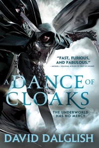
The Making of a Cover: Design Roughs

Welcome to the most in-depth, behind-the-scenes, play-by-play account of how a cover is born, from the point of view of the Art Department. We’re charting the conception and birth of the Shadowdance series by David Dalglish.
So far we have talked about the first real step of a book, Acquisition, and then what goes into Cover Briefing. Then we let our minds wander and collect inspiration and form Directions for the cover. Then we agreed on a Photographer and Illustrator. We’ve even found our hero, the Cover Model. And we found a Trampoline for him to do stunt work on safely. We decked him out in book-specific Costume & Props. We spent all day at our Photo Shoot. After receiving the Rough Cuts and narrowing down the images, it was time for the illustrator to get to work, and while he did, Kirk was already working on the Design Roughs.
Kirk Benshoff did the type design for the covers, so I’ll let him take it from here…
Once we’ve decided on what images we want Gene to work on, I need to figure the style of how Gene is going to retouch the images. I also need to work out the layout and type options. This stage of the process can get hectic as I’m trying to figure out more than one thing at one time, so I have a few balls I need juggle.
Especially with a first volume in a series, there are essentially four things needed to establish the look and feel for the cover:
- Image Treatment/Style
- Image Crop
- Layout
- Typography
Image Treatment/Style – In other words, we just shot pictures of Bryce as an assassin, but I need the pictures stylized or “Orbit-ize” if you will. We did talk about this in the early concept stages, but now we have images from the photo shoot. I want to explore variations of the initial concept or maybe even an entirely new idea if inspired just to make sure we are getting the look and feel we want. Do we want the final image to look high contrast like the movie poster for Ninja Assassin? Or HDR like the cover for The Heroes by Joe Abercrombie? Do we want the image styled monochromatic, black and white, bright or with a muted color palette? Keep in mind, this is the first book in the series and we can’t change the style later. So we want to be confident with the choice right from the start. Figuring this out is the first item I work on so I can give direction to Gene when I give him the specific photo’s to be retouched.
Here are some of the options I presented internally for the Image/Treatment Style. How did we want the background? How was the art going to be stylized? These are very rough so we can get a knee jerk reaction to a direction.
- Muted Style with a Soft Textured Background
- Saturated Style with a Cracked Background
- Contrasted Style with Smokey Background
- Monochromatic Style with Light Burst Background
- Saturated Style with Solid Color Background
- Contrasted Style with Smokey Background Alternate Color
Image Crop & Layout – Once we’ve decided on the style and get Gene started on his magic, I start playing with the image crop and layout. These two usually happen at the same time as I need to figure out how to incorporate the title, by line, reading line, marketing stickers/callouts, and/or quotes while taking advantage of this photo we worked so hard to get. When I start this part I don’t have anything from Gene yet, so I have to use rough comps I’ve worked up myself as a placeholder. I’m also using placeholders for the type as well. I just want to see how all the request elements plays off each other and get feedback from the my colleagues. As soon as I get an initial pass from Gene, I start incorporating his rounds into my comps. At this point, I act as the relay between internal and external folks mocking-up options, communicating comments, and executing the designs.
Here are some of the later options I presented for the Image Crop & Layout. We settled on the style and background, I got an initial composite from Gene, so now I can focus more on the details of the layout.
- Broad Crop
- Tight Crop
- Middle Ground Crop
Typography – If left on my own without deadlines I could work on type forever. It’s fun and it can turn into a Pandora’s Box of options that can make the cover look completely different from option to option. I usually want to see as many directions as possible in the layout before I rule them out. Even if the type is totally crazy looking, it helps me landslide into new ideas. There are a few things a designer needs to be mindful of while designing the type for a cover: Is the type going to stand out if someone is looking at it from a distance? If it’s a series, will the type work across all the volumes? Is the type effectively branding the series? Typography usually elicits a gut reaction from people. If anyone has an association to the type in anyway shape or form, positive or negative, that can effect it’s standing. After a lot of back and fourth, we get the type that’s pretty much where we want it.
Here is a sample of the options I presented for the Typography. I like to work out type separately in Adobe Illustrator than bring into Photoshop to then integrate with the art more.
- Options on their own.
- 1
- 2
- 3
- 4
- 5
- 6
- 7
- 8
At this point we have a whole table of directions and options and it can be more than a little daunting. Everyone looks at the covers from a slightly different point of view, and little by little we whittle down the choices. Everyone is trying to narrow it down to the covers that best portray the book, are the most dynamic and eye-catching, and will appeal to the target audience the most. We also keep in mind how the design will fit in with the current marketplace and into the Orbit look overall. One by one we flip over covers like a giant game of memory until we are down to everyone’s favorites, and then often the intense debate happens. It’s this collaboration of passionate people all trying to figure out what’s best for a book that makes Orbit awesome. We all want the book to succeed and we all have slightly different points of view about how to get there. The cover meetings are often where everyone is forced to articulate their reasoning and really weigh everyone else’s inputs. Even though it’s Art who gets the covers made, it’s really a team decision that shapes them.


