The Making of a Cover: Photographer & Illustrator

Welcome to the most in-depth, behind-the-scenes, play-by-play account of how a cover is born, from the point of view of the Art Department. We’re charting the conception and birth of the Shadowdance series by David Dalglish.
So far we have talked about the first real step of a book, Acquisition, and then what goes into Cover Briefing. Then we let our minds wander and collect inspiration and form Directions for the cover. After a period of brainstorming, it’s time to pick how the art is going to be made, and contact a Photographer and/or Illustrator.
I’m going to let Kirk Benshoff, who was also working on the Art Direction, and would ultimately do the Cover Design, to take it from here:
As I was reading over the cover briefing form in the launch meeting and listing to Devi talk about the Shadowdance series, my mind immediately went to Crouching Tiger, Hidden Dragon. I had this image of the covers showing a martial artist, in mid-move, getting the beauty of the fighting style and in postproduction introducing the brutal and badass. I felt these books needed to be photographs to give a connection to Haern that illustration wouldn’t have. I want Haern to be alive. I want to see people dressed like him at Comic Con.
I did do some research looking for illustrators as well, to show different directions. And even though I had some amazing talent on the docket, I still had the photo shoot on the forefront of my brain. I knew the photo option would be the most badass direction and I also knew it would be an enormous amount more work and expense to pull it all together as well as I could imagine it in my head.
Game on! ;)
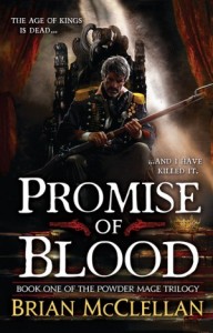
At this point, Kirk and I met again, to combine all our inspirations and talk about how we were going to pitch the ideas we had to Editorial. We talked about really wanting to make it a photo shoot, even though that would be a lot more work. We decided we really wanted to use Michael Frost and Gene Mollica, a photographer and illustrator pair that we work with frequently. You might remember them from Orbit covers such as the new Joe Abercrombie series look and Brian McClellan’s Powder Mage Trilogy:
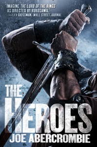

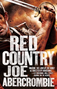
Kirk & I have worked with this team extensively, and we knew that not only was Michael a master photographer, able to capture whatever tone and feel we wanted for the series, but Gene is also always up to a challenge and would absolutely go crazy finding the perfect costuming and props for the project.
Back to Kirk:
Whenever a designer has a grand/broad idea that involves a lot of pieces, a big part of my job is to help my editors visualize my concept so they feel comfortable moving forward. I felt my concept was ultimately in two parts… getting the overall shots in the photo shoot and then having an illustrator like Gene Mollica introduce more “style” and push the shots in post.
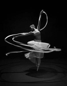
So to give an idea of the types of shots I wanted to get from the photo shoot, I looked to not only kung fu/fighting images but also dance photographs as well. The dance photography gave great examples of people in motion with clothes moving in a similar way that Haern’s three-piece cloak moves in the book. This was tricky; in that the dance photography is very “beautiful” and I need to make sure folks here are focusing on these being examples of the types of raw shots I wanted to get from our photo shoot and not representative of the final look and feel.
So to address the final style, I brought out comps to show how we want the books to look. In other words, these are examples of what I want Gene to turn the images into. I wanted a cross between the brutality of Ninja Assassin and the fantastical framing and presence of the old Todd McFarlane Batman images.
In the next cover meeting, we presented all of these images and discussed the idea of doing a huge photo shoot for the first three books, and then adding in the next three and shooting enough for six books at once. This way we’d have a wealth of images to pick from for the future books, without having to worry about recreating the same costume, same lighting, same conditions. It would be a massive undertaking, but we felt that this would bring a cinematic approach to the covers that incorporated the feel of the fight movies as well as the dance photography in a way a non-photo illustration wouldn’t be able to match.
Cover meetings at Orbit are pretty informal. Tim Holman, our Publisher, and I have wanted to keep a space safe for collaboration and honest opinion, with as little bureaucracy as possible. So yes, it can be a geek free-for-all sometimes, but when everyone is super excited and agreeing on a direction the energy is infectious. In this case, Kirk showed all the ideas and directions and comp images he had, and pitched the idea of a massive photo shoot to cover many books at once. It’s Art’s job to focus on the coolest ideas and push the envelope design and art-wise. It’s the Editor and Publisher’s job to not just get swept up in how awesome the cover art will be, but also take into consideration the marketplace, the book’s positioning and target audience, the budget constraints, and if the direction will fit into the bigger picture of Orbit’s publishing goals. In this case, we all agreed that this was going to be awesome, as well as great for the series. This was also where the idea started to form that we would be able to do this series of posts for the Orbit blog.
So with Editorial and Art on the same page about style, direction, and the freelancers we were going to use, then we were faced with the problem of “be careful what you wish for” — this was going to be a massive undertaking.
