The Making of a Cover: Directions for the Shadowdance Series

Welcome to the most in-depth, behind-the-scenes, play-by-play account of how a cover is born, from the point of view of the Art Department. We’re charting the conception and birth of the Shadowdance series by David Dalglish.
Sorry for a bit of a delay, there, folks. Here in the Art Department we love taking you behind the scenes to see how all he Orbit art comes together, but sometimes we get crazy swamped finishing a season! Time to get caught up! So far we have talked about the first real step of a book, Acquisition, and then what goes into Cover Briefing. Now comes the research part, Directions. When last we left you, Editorial had filled out the Cover Briefing form, and we had all gotten together in a Launch Meeting to talk about what our expectations and plans were for the cover. Now it’s the Art Department’s turn to let it digest in our minds for a little while.
In the meeting we talked about the influence of Brent Weeks’s Night Angel Trilogy, but that’s not enough inspiration. Part of my job at Orbit is keeping tabs on everything going on in the geek world, and art world, that could be used to influence or inspire what goes into our covers. I make sure to know what’s going on with other authors and publishing houses and their new covers. I also keep an eye on “geek” culture at large—movies, television, comics, pop culture. On top of all that it is a major part of my job to keep up on artists and trends happening not only in the SFF world, but also in many genres of illustration, design, photography, even prop-making. Once I get a project like this I let it sit and kind of germinate in the back of my mind for a little while, almost like a lint ball under your bed, gathering mass that might seem random and unrelated, but grows into something little by little. As Creative Director, it’s my job to assign who works on what. I knew this was going to be a huge project, so at this point I approached Art Director Kirk Benshoff about being the Designer for the covers, but also assisting with the idea generation, and then taking point on the Art Direction, whether it ended up being a photo shoot or an illustration. So he started brainstorming as well.
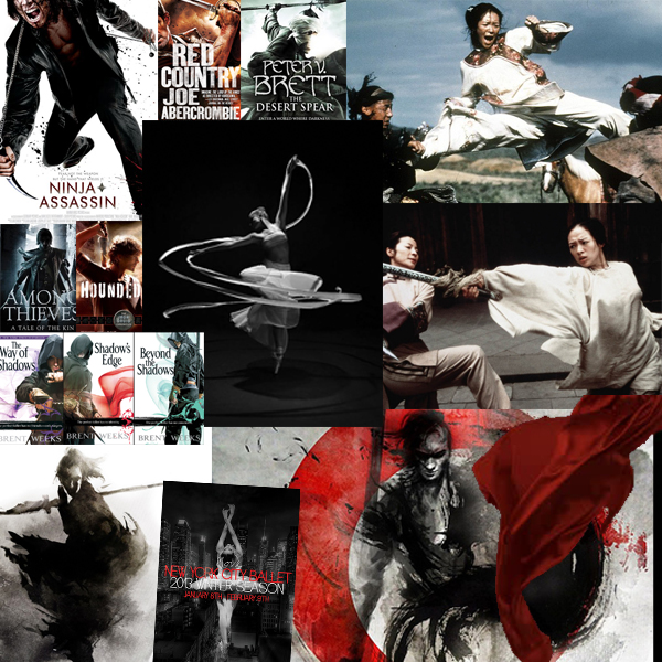
And this random mess below, is kind of a window into what was inspiring us: ninjas, samurai, dramatic dance photography, billowing fabric, brush & ink illustrations, other book covers in the field that had the same kind of drama and energy we were after, beautiful wirework fighting scenes.
So Kirk and I let this all just come together, and ferment a bit in our minds, never seeing something that exactly fit, just a lot of elements and inspirations…

