The Making of a Cover: Cover Briefing the Shadowdance series
 Welcome to the most in-depth, behind-the-scenes, play-by-play account of how a cover is born, from the point of view of the Art Department. We’re charting the conception and birth of the Shadowdance series by David Dalglish.
So last week we talked about the first real step of a book, Acquisition, which is how a manuscript finds it’s way from the author to the editor, usually via an agent. We’re glossing over a ton of Editorial detail because this is a series about covers, but rest assured, there’s a lot of meetings, discussion, impassioned debate, etc. going on there. I mention it as part of the cover process at all, because, as Devi mentioned, at Orbit, discussing possible cover directions can often help us decide whether or not we are going to try to acquire a new author, series, or book. Very frequently Tim or one of the editors will brainstorm with me about what kind of cover a book they’re thinking of acquiring might have. How would it be different from the other books in the same subgenre at Orbit already? Would it be a chance to do something awesome and push the look of covers in the marketplace? Do I have a gut feeling initially about whether it would have to be photo, or illustration, or design? This can be dangerous because asking me to think about a cover direction is like letting a greyhound out of the starting gate and my brain is halfway down the track before I remind myself that we might not end up buying the book and then I’ll be all disappointed.
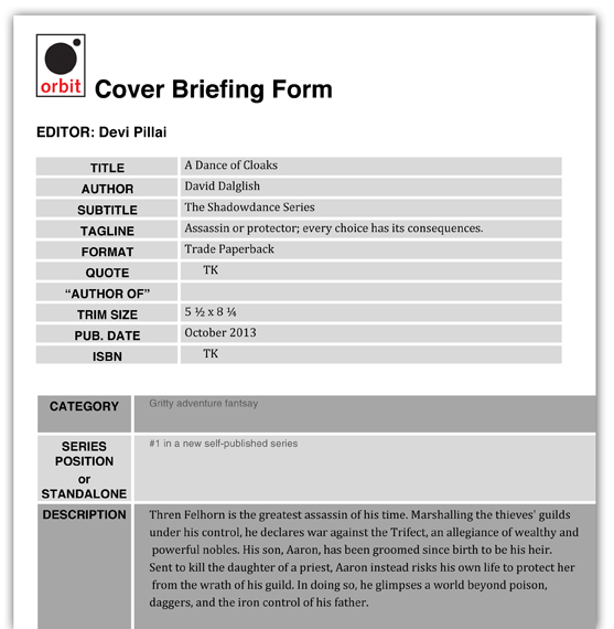
So, because at Orbit we’re all brainstorming on things all the time, Acquisition kind of bleeds into this stage, Cover Briefing. Which is when Art & Editorial have a meeting and Editorial officially tells Art to start working on a cover. Over the years I’ve refined a “Cover Briefing Form” to help Editorial get all of their thoughts down on paper. It’s not so critical that every piece of info is final, it’s more of a jumping-off point for a discussion. For example, if you look at the Cover Briefing Form for the first Shadowdance book, A DANCE OF CLOAKS (US | UK | AUS), you’ll see the tagline was different, and we didn’t have a quote yet. But Devi and I had already talked about how we wanted to focus on cloaks and movement and dance, so she already put that in the notes.
Cover Briefing A Dance of Cloaks
We also talk about what the priorities for a cover are – simply put, what things do we want the cover to say, and in what order. Alex Lencicki, our Marketing and Publicity Director also comes to the cover launch, and he contributes greatly in talking about what the target audience for a book would be, what is going on in the rest of the marketplace, what competition would be for this book, etc. For this series we knew we wanted great dynamic action first, we wanted to grab people with the cool factor of the action as our first priority. Target audience was slightly more dominantly male, but not exclusive to female fans. We were looking to please our genre audience, but also attract some action movie fans as well.
Any author input already given to the Editor will be discussed at this stage, and often the Editor and I will talk about what materials I can get started on – do we have a manuscript ready to read? Just a few sample chapters? I also find it really helpful to make sure to check in with the author at the beginning of the cover process, either through the editor or directly with the author. I think Orbit is pretty unique in that I try to keep the authors as much in the loop as possible through the cover process. In SFF, so much is created straight out of the author’s imagination, it’s really helpful to hear world building details and ideas directly from them. Some have even made pinterest inspiration boards that I can look at for inspiration. At this stage I really have no idea what direction we’re going to take, I’m just gathering as much info as I can, to stew on for a little while.
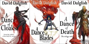
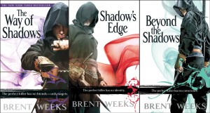
An interesting difference in this particular series is that David did self-publish the first books in the series, and he already had covers…covers that look terribly familiar to everyone at Orbit. It’s no secret that David was influenced heavily by Orbit’s Brent Weeks covers, he jokes about how influenced the covers are in the last post, and it makes sense, given that fans of Brent Weeks will seriously love David Dalglish’s books. So we took it as a challenge.
When the Night Angel trilogy came out – which was even before I came to Orbit – thanks to Calvin Chu, Keith Hayes, & Peter Cotton for the art & design – the idea of a character on a stark white background with graphic elements was shockingly different from the rest of the covers in the genre. Photo-illustrated covers were really still in their infancy in SFF, and they really stood out. Over the years since then, these covers really influenced the whole genre, to the point that a cloaked guy on a graphic background is a bit of a cover cliché now. So we could do something completely different – maybe go for a more painterly look, or have full background scenes…or we could take a fresh look at what we did for the Night Angel books and say, if we were going to do that today, as opposed to 5 years ago, what would we do? How would we level up, make it even more completely awesome, push it ahead of the market again?
No pressure, right?
So that’s pretty much Cover Briefing – one big geek brainstorming session between Editorial and Art, which ends generally with Editorial challenging Art to be more awesome than ever. And I take all that info and promptly sit on it and let it stew in the back of my head for generally a week or two…
Next Week: Cover Meeting I: Cover Directions!


