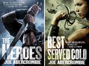
Cover Launch: JOE ABERCROMBIE in Trade Paperback!
 I am so freaking excited to finally let these covers out into the world. Joe Abercrombie is one of Orbit’s most exciting authors (never mind the snarkiest) and I have been dying to take a fresh look at some of his covers. When I read his books I feel like I am watching a movie, and I just wanted to get across that sense of action and brutality and sheer bloodiness all into the cover at once. So, stealing some style markers from hi-action sports photography married to a lot of fantastic armament (some things you just can’t fake in photoshop), we present to you the most badass covers I have ever had a hand in. As you can see from the process shots after the jump, we got a lot of the shot done in the camera, thanks to the technical wizardry of photographer Michael Frost. Photo-illustrator Gene Mollica hunted down all the proper bits of armor and sharp pointy things (some of which he had custom made because he is such a perfectionist), and then when it was his turn to illustrate, he turned the already-fantastic photos into sheer magic in post-production. We also have to thank Adam Becker for the use of his great action pose ability, and Heather Ann Burton for her scowling personification of Monza.
I admit I was a bit terrified to show these to Joe…these covers have more in common with movie posters than most covers in the fantasy section…and Joe is a really savvy author on visuals — he’s had a lot of different styles, and he’s not afraid to give his opinion. And I was in love with these, which makes it even more stressful showing the author. So what did he say?
“It’s got attitude, it’s got individuality, it’s got big forearms.”
More from Joe (and big cover shots…and animated process covers! ) after the jump…
“In your face. I take absolutely all the credit I can possibly get for these, of course, but of equally course, I don’t deserve any of it, for they are the brain child and indeed work of the Art Director at Orbit, Lauren Panepinto, and my US editor Devi Pillai. The treatment was basically for something reminiscent of modern sports photography – high contrast, high detail, high drama, fast shutter speed, frozen action. A filmic approach, you might say, and I think they’ve totally nailed it…In summary they look like tough, edgy, very modern, kickass action fantasy for the discerning man or woman of today. Which of course is what they are.”
Whew! Joe will be posting more of his thoughts about this new direction on his blog, but in the meantime…

So since these are reissues, I’m not going to put teaser text here but you can read excerpts from THE HEROES and BEST SERVED COLD at those links…
Can’t wait to here what you all think! Comments below…


