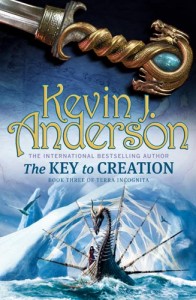
A look behind the cover art of THE KEY TO CREATION
 THE KEY TO CREATION has now been released in trade paperback, completing Kevin J. Anderson’s TERRA INCOGNITA trilogy – which in Kevin’s own words is “A complex and sprawling tale of sailing ships and sea monsters, intrepid explorers voyaging to uncharted lands, and a religious war that has thrown two continents against each other.”
If that doesn’t sound extremely cool, we don’t know what does. If you’re itching for some exciting swords-and-sails action, then rejoice because the first two books in the trilogy – THE EDGE OF THE WORLD and THE MAP OF ALL THINGS – are readily available in mass market paperback. So if you like your sea monsters, quite frankly you’ve got no excuse.
To mark the completion of the TERRA INCOGNITA trilogy, we asked cover artist Lee Gibbons a few questions about the wonderful illustrations he came up with for the books.
Can you tell us a little about the way you approached illustrating the TERRA INCOGNITA series? Were there any particular influences that you drew upon?
When I was first commissioned to produce these illustrations, Peter Cotton the designer had already decided on the layout he wanted: two elements separated by the type. It was always planned to have a scene at the bottom of the page and a close up of a piece of shiny navigational equipment at the top, linked by the map in the background.
Two things I had to bear in mind from the brief were that this had to appeal to both the UK and US markets and also to downplay the fantasy elements in the maritime scene, instead emphasising exploration and adventure. To this end, I drew on the influence of Victorian maritime paintings, which I have always had a soft spot for.
By the time we arrived at book two things had got a bit free and easy as regards the fantasy content! I was keen to have the map background continue across the three covers, but have to admit that with the type in place you would be hard pressed to notice that on the final printed covers.
Do you do research before embarking on a brief and if so what form might this take?
This varies from cover to cover. A historical novel set during the dark ages say will need extensive research before I even start to sketch out the rough ideas. There is obviously a lot more freedom with a fantasy subject but we wanted to show an advance in ship building technology between books one and two so it was worth looking at late medieval ship design. Of course it’s good to have a credible starting point to work from, but the important thing is that you end up with a good fantasy cover.
Now you’ve done the covers for all three TERRA INCOGNITA books, do you have a favourite? And if so, for what reason?
Technically, I was very pleased with the way THE KEY TO CREATION turned out, but THE MAP OF ALL THINGS was the first all-out monster on the rampage illustration that I have been allowed to do in the last 15 years! It also allowed me to get away from the computer to do some sculpting and miniature photography for the sea serpent, which made for a nice change.
Kevin J. Anderson himself is a big fan of the artwork you’ve produced for his series, calling you ‘exceptionally talented’ – how satisfying is it to have authors praising the artwork you’ve created for their books?
A book’s cover design and illustration has to go through a lot of stages of approval before it finally goes to print. This can result in drastic changes from the original concept to the final printed version.This often means that the the finished artwork can be a long way from what you (and sometimes the author) had in mind when you first read the manuscript.
This can be especially true for science fiction and fantasy, where there can be an enormous gap between the visual interpretation of a book and the vision in in the author’s head. So when an author gets in touch with such high praise it’s extremely satisfying! The great thing about this series was being able to discuss specific design elements of the covers with Kevin which is very rare but incredibly useful for the artist.
You’ve worked on fantasy cover art for many years now. What do you enjoy about working with genre titles that you might not get with more mainstream books?
When I started reading science fiction in my teens the cover art had a huge impact on me. I would often buy a book on the strength of the cover alone even if it frequently bore no relation to the contents! At the same time the magazine ‘Science Fiction Monthly’ was released, featuring A3 size reproductions of cover art by the likes of Chris Foss and Bruce Pennington. On the strength of this I decided if I couldn’t get a job in the film industry as a special effects man, I would learn how to use an airbrush and become a science fiction cover artist.
Even after all this time there’s still some of that fan-boy enthusiasm for fantasy and science fiction. Having said that, once a job has got past the first concept sketches (my favourite part of the process) the actual work of producing the finished digital illustration is pretty much the same for fantasy as it is for a thriller.
Many thanks for talking to us, Lee!

