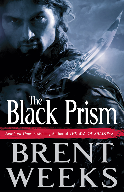
Cover Launch: THE BLACK PRISM by BRENT WEEKS
 Ladies and gentlemen, I present the cover for the first book of the highly anticipated new trilogy by Brent Weeks. The Night Angel Trilogy (starting with the New York Times Bestseller THE WAY OF SHADOWS) has been a huge success worldwide and I know a lot of people have been dying to see what Mr. Weeks writes next. Well you’re going to have to wait a little longer for the book, but I can give you a little taste by showing you the kick-ass (yes, that’s a technical design term) cover for THE BLACK PRISM.
I don’t want to say too much about the new series (because the editor will kill me if I give too much away) but Brent has created a very cool new world, complete with solid characters and a really interesting magic system. If you liked the Night Angel Trilogy, you’ll love this (And if you haven’t read the Night Angel Trilogy, you should be ashamed of yourself, really.)
Here’s a little description:
Gavin Guile is the Prism, the most powerful man in the world. He is high priest and emperor, a man whose power, wit, and charm are all that preserves a tenuous peace. But Prisms never last, and Guile knows exactly how long he has left to live: Five years to achieve five impossible goals.
But when Guile discovers he has a son, born in a far kingdom after the war that put him in power, he must decide how much he’s willing to pay to protect a secret that could tear his world apart.
Whet your appetite? Torture you a bit? You know the book’s not coming out until August, right? Yep, I’m mean. Anyway, back to design. The art was created by the fabulous Richard Jones, and I think it really captures the general bad-ass tone of Brent Weeks’s stories. Here it is again, BIG:
Again, I don’t want to give too much away about the story, but the really interesting world Brent has created, especially the, say, physics, of this world, really impacted the cover design. And while you know I actually do read all the manuscripts when they come in, and I try to be as accurate as only a artist and fan can be, some books are still harder to truly nail than others. Your friendly neighborhood Creative Director here really had a hard time balancing how much to show, what tone the cover should have, what the color of the cover could be (hint, hint), and still remain true to the story and world inside. We must have gone through a thousand poses, color and lighting treatments, and crops. Debate raged for months over this one, as some of you heard about when a prior version of the cover was unofficially released. What was great was so many people were involved in the development of this cover, and so much feedback was taken into account, that I think we’ve really nailed this cover for a book which we hope will blow you away both inside and out.
(Now, also imagine for me that the cover will have fancy foil bits and fancy cover effects, none of which come across onscreen. Especially for the type. But in general, you get the idea.)
Now we can officially launch this cover here on our lovely blog, as I know all you Orbit fans love me to do. (I know, you’ve been so patient waiting for this one, I appreciate it.) So…what do you think?

