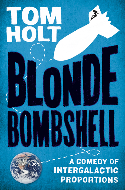
Cover Launch: BLONDE BOMBSHELL
 Don’t tell me you haven’t read Tom Holt yet! You love Douglas Adams, read Terry Pratchett, dabble in some A. Lee Martinez, but you haven’t discovered Tom Holt? Well, now is your chance. A huge favorite in the UK, Tom Holt has an impressive backlist of that kind of really funny, smart, and absurdist humor that we all met with the Hitchhiker’s series (way back in what, high school?) and need a pretty steady fix of. I admit I had never been introduced to his books before, but Orbit UK has been publishing him for a long time, and he’s developed quite an underground fan base in the US, who subsist on a diet of imports. This release will be not only the US launch of Tom Holt but also the start of a new cover look for the UK.
Blonde Bombshell is a great jumping-on point if you’ve never read Mr. Holt, and if you’re already a fan, you’ll be excited to hear that it’s Tom’s first book that is more of a humorous science fiction, (rather than humorous fantasy) novel. Here’s a description:
The year is 2017. Lucy Pavlov is the CEO of PavSoft Industries, home of a revolutionary operating system that every computer in the world runs on. Her personal wealth is immeasurable, her intelligence is unfathomable, and she’s been voted ‘Most Beautiful Woman’ for three years running. To put it simply – she has it all.
One thing, however, is not quite right in Lucy’s life. She doesn’t realize it yet, but she is in fact a bomb.
And not just any old bomb. Lucy is a very big, and very smart bomb, and her mission is to blow up the planet known as Earth.
I had a really hard time figuring out a new look for his books…we wanted to keep the flavor of the UK covers, but punch it up a notch. I really wanted to capture the absurdist humor angle, but still have it read science fiction/fantasy… And hovering above all of that is the fact that reading Tom Holt reminds me very much of reading Douglas Adams, and I pity anyone who has to redesign Hitchhiker’s Guide to the Galaxy. It’s had a thousand looks and they’ve all been pretty terrible from a design point of view. Giant thumbs, bad looking futuristic books, scary smiley faces…There’s just too much going on, and nothing really captures the feel of the book well. Trust me, I’m not faulting the many designers who have tackled that problem, I’m just very glad I’m not one of them. So most importantly, I wanted to capture the feel of the book, and give you a little hint of what the story is about. Hopefully I’ve achieved that, so feel free to let me know what you think in the comments. (Or to yell at me because you think so-and-so’s version of Hitchhiker’s was the best piece of design from the 80s, 90s, whatever…)

