Cover Launch: Best Served Cold
 Good Afternoon from the Orbit US Art Department. Today we’re giving you a sneak peak at the new Joe Abercrombie title, BEST SERVED COLD. (Out in July in the US)
This book is an exciting new chapter for Abercrombie fans, and a great place to jump on if you’ve never read Joe’s books before. This title is a standalone, so don’t worry about needing to know backstory, just jump in…
Best Served Cold is the story of Monza Murcatto, the Snake of Talins, the most feared and famous mercenary in the ruthless Duke Orso’s employ. Her victories have made her popular — a shade too popular for her employer’s taste. Betrayed, thrown down a mountain, and left for dead, Murcatto arises with a broken body and a burning hunger for vengeance.
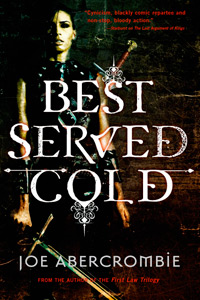
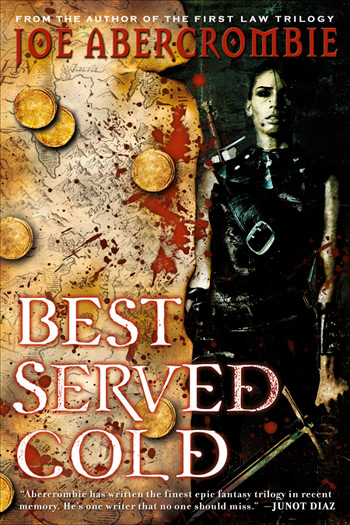
“A Girl?!” you say? Well, trust me, this is pure Joe Abercrombie. It is as action-packed, as edgy, and as bloody (as you can see from the cover) as any epic fantasy I’ve read in a long time. However, it also opens the door for a brand new audience of female readers (myself included) to get sucked into Joe’s vivid storytelling and the world of Styria. This book is both true to Joe’s First Law Trilogy and a huge step forward into exciting new terrain.
That said, there was much debate in the halls of Orbit as to how we should handle the cover of this book. Joe’s UK publishers have established a very specific look with The First Law Trilogy and are following that through with Best Served Cold.
Genres develop certain visual cues, and this happens in all kinds of media — book covers, music packaging, and even websites. Old manuscripts and maps evoke armies and fighting and war. The same way a slick photographic style says urban fantasy. As visual beings we make snap judgements from these cues, and a designer knows these cues and when to use them or purposfully confuse them.
Our approach was to focus on a more character-driven cover, while keeping the grit and dirt and gore of the epic fantasy look. The fabulous Hsu & Associates Design and Michael Turek Photography were put on the case. They did a series of great covers, but they just didn’t capture the raw violence of this book. We had one huge issue — the main character is a woman, and a good chunk of male fantasy readers think any cover with a woman on it is immediately girly urban fantasy fluff. So we kept pushing the texture, and the grit, and we came up with a gorgeous image and design…
We loved this last cover. It’s gritty, it’s character-driven, it’s dark, and the texture is gorgeous. If the main character was a man in a loincloth or armor, let me tell you, this cover would be it. Unfortunately, it’s an ugly stereotyping of the genre (and we here at Orbit are all about challenging stereotypes), but a woman on the cover still reads urban fantasy to a lot of people. We showed the cover to Joe, who thought the cover was great, but he was also concerned about his fans. We didn’t want to alienate epic fantasy readers, and of course we didn’t want to misrepresent it as an urban fantasy book. But we truly felt that it was important to have Monza on the cover — so we decided to combine the two.
And after a lot of photoshop and a LOT of playing, we reached a happy medium. It speaks to Joe’s core audience of shields-and-swords fantasy readers, but opens the door for new readers to be interested by the mixed signals of the cover and pick it up. And that’s our goal — getting a person in a bookstore who has never heard of Joe Abercrombie to pick it up. Because if they give the book that chance, read the flaps, read the praise that Joe’s great writing has already achieved, then we have them. Do we expect that there will be some controversy? Of course, I can hear it already. I grew up a girl in a male geekboy’s realm and I am well used to being downplayed, dismissed, and told to “go watch Buffy” (and ogled, but that’s a post for another time). I am female, but I love epic fantasy. I love swords-and-shields AND love urban fantasy. And there are a lot of women like me out there. And there are male urban fantasy readers as well. (Don’t tell me no, who do you think is buying those Dresden Files books, hm?) And this book, which has such a great, strong, female heroine (or antiheroine, if you prefer), is something I would pick up and love. Joe’s writing will succeed on its own merit, and we of course expect he’ll gain new readers through reviews. However, I believe, as a book designer, that a cover is successful if it reaches the same audience that the interior of the book does. And I believe this cover does that. Is it controversial? of course. Is it a mashup of different styles? yes. But Joe is pushing the envelope and challenging readers, and so should we here in the Art Department.
Comments? I LOVE IT. Bring it on. But be warned, Don’t try to challenge me on genre trivia, I started working in a comic book store when i was 16. I will crush you on geek references.


