Author Archive

A CROWN FOR COLD SILVER: The Making of the Map

Welcome to a behind-the-scenes post on how maps get created in the Orbit universe. I thought A CROWN FOR COLD SILVER (US | UK |AUS) was the perfect opportunity to do a write-up on, because the map design even made it to the cover. I’ll be your narrator, and welcome Author Alex Marshall, and illustrator Tim Paul.

LP: People often ask how we decide which books are going to have maps, and most times it is author-driven. Some authors use mapmaking as part of their worldbuilding process, and some authors only have a more general idea of geography as they’re writing. If a map or diagram comes naturally out of a story, then I always like to create something to expand the reader’s experience of the book. And sometimes a “map” is not really a map – for example we’ll be doing a process post soon on BLACK WOLVES (US | UK | AUS) by Kate Elliott – that book has tattoo designs for each important clan in the book in lieu of a geographic map.

In the case of A Crown for Cold Silver, I knew the author had a very specific concept for the map, and when I want the author and map maker to work together directly, my go-to artist is Tim Paul. I’d actually known Tim for a few years for his more stylized illustrations. One day we were sitting at the Society of Illustrators in NYC, at some art event or another, and he was saying he was dragging out all his old Dungeon Master props and maps to start up a Dungeons & Dragons campaign. He was talking about how much he enjoyed geeking out on the mapmaking, and my head snapped over to him and I said, so….you like making maps huh? Have you ever illustrated one for a client? (See, networking is real!)

TP: Hurray for networking, and talking about yourself!

LP: Map illustrators are a special – and rare – breed. You have to really be into the process of drawing the map out of the author, and tolerate a lot of fine-tuning. If you aren’t really excited by that, then you burn out quite quickly on all the revisions. You have to love the collaboration process. Many illustrators feel map work isn’t as creative as other types of illustration, but good mapmakers know there’s a lot of room for artistic license.

TP: It’s true about being a rare breed. I’ve had lots of illustrators tell me they won’t touch maps, and those few that do try, end up deciding not to do them again. As one person described, it’s like doing 50 – 100 little illustrations that are always changing. I actually find drawing thousands of little trees and mountains relaxing, even as I strive to make each mountain unique.

I’ve played D&D since I was 14. The maps in the books and modules were one of my favorite aspects. As a kid, I always made my own maps and worlds. Surprisingly, it took a long time to put my love of making my own maps into another way to making a living with my art. (more…)

The Making of a Cover: Final Books (and video!)

Welcome to the most in-depth, behind-the-scenes, play-by-play account of how a cover is born, from the point of view of the Art Department. We’re charting the conception and birth of the Shadowdance series by David Dalglish.

So far we have talked about the first real step of a book, Acquisitionand then what goes into Cover Briefing. Then we let our minds wander and collect inspiration and form Directions for the cover. Then we agreed on a Photographer and Illustrator. We’ve even found our hero, the Cover Model. And we found a Trampoline for him to do stunt work on safely. We decked him out in book-specific Costume & Props. We spent all day at our Photo Shoot. We received the Rough Cuts, and while the illustrator was working, Kirk was developing the Design Roughs. Then we got the Final Retouched Illustrations in and got to the design on the Final Covers. And now, believe it or not, we’re at the end of our little cover art journey, and even though you’ve seen the final book designs in the last post, I give you a treat:

It’s been a pleasure taking you through the cover process for such a fun series. We really put a ton of work into all our covers here at Orbit, and I hope you’ve enjoyed peeking behind the curtain. I don’t think people realize quite how many moving parts, how many stages of work, and how many people make up the cover process. And remember, we’re doing a whole season’s worth of covers at once. Whew.

Thank you to amazing ninja Bryce Bermingham, Photographer Michael Frost and his team, Illustrator Gene Mollica, the team at Hollywood Stunts, our video guys Eric Westpheling and Louis Rebecchi, our prop makers and costume builders and everyone who had a hand in bringing these covers to life. Thanks also to Kirk Benshoff, my co-conspirator in Art Direction & Design. And of course, thanks to David Dalglish, who thought up such a cool concept for us to make a reality.

The Making of a Cover: Final Cover Designs

Welcome to the most in-depth, behind-the-scenes, play-by-play account of how a cover is born, from the point of view of the Art Department. We’re charting the conception and birth of the Shadowdance series by David Dalglish.

So far we have talked about the first real step of a book, Acquisitionand then what goes into Cover Briefing. Then we let our minds wander and collect inspiration and form Directions for the cover. Then we agreed on a Photographer and Illustrator. We’ve even found our hero, the Cover Model. And we found a Trampoline for him to do stunt work on safely. We decked him out in book-specific Costume & Props. We spent all day at our Photo Shoot. We received the Rough Cuts, and while the illustrator was working, Kirk was developing the Design Roughs. We even looked at the Mapmaking process. Once the illustrator was done, he sent over the Final Retouched Illustrations for Kirk to input into his designs, getting us to Final Cover Designs!

You’d think, after all the work on the design, and all the work on the images, that Kirk’s work would be over, but there is still the cover mechanical to send to the printer for the final printed books. Here’s Kirk Benshoff to go into more detail about that:

Up to this point all of the focus has been on the front cover, which is ultimately the main draw to get people to pick up the book, look at it, and ultimately buy it. But what happens if the book is not face out in a bookshelf? What do you want the rest of the experience to be once someone has the book in his or her hands? The book needs a strong shelf presence to stand out amongst a lot of other titles in a bookstore.

In all, the cover is broken out into three parts: the front cover, spine, and back cover. The spine needs to visually identify the book when it’s shelved in a bookcase. In the event that someone who is familiar with the book wants to find the next volume in the series, an identifiable spine design will make it easy for that person to find what they need. If we’re looking to court a new reader who is not familiar with the property, we want the spine to be as engaging as a tall and thin surface area can be so someone can get a taste of the cover, be compelled to take it out, and look at it.

(more…)

The Making of a Cover: Final Retouched Illustrations

Welcome to the most in-depth, behind-the-scenes, play-by-play account of how a cover is born, from the point of view of the Art Department. We’re charting the conception and birth of the Shadowdance series by David Dalglish.

So far we have talked about the first real step of a book, Acquisitionand then what goes into Cover Briefing. Then we let our minds wander and collect inspiration and form Directions for the cover. Then we agreed on a Photographer and Illustrator. We’ve even found our hero, the Cover Model. And we found a Trampoline for him to do stunt work on safely. We decked him out in book-specific Costume & Props. We spent all day at our Photo Shoot. We received the Rough Cuts, and while the illustrator was working, Kirk was developing the Design Roughs. Here’s Kirk Benshoff to talk about the Final Retouched Illustrations: (more…)

The Making of a Cover: Interior Maps (Bonus)

Welcome to the most in-depth, behind-the-scenes, play-by-play account of how a cover is born, from the point of view of the Art Department. We’re charting the conception and birth of the Shadowdance series by David Dalglish.

So far we have talked about the first real step of a book, Acquisitionand then what goes into Cover Briefing. Then we let our minds wander and collect inspiration and form Directions for the cover. Then we agreed on a Photographer and Illustrator. We’ve even found our hero, the Cover Model. And we found a Trampoline for him to do stunt work on safely. We decked him out in book-specific Costume & Props. We spent all day at our Photo Shoot. After receiving the Rough Cuts and narrowing down the images, it was time for the illustrator to get to work, and while he did, Kirk was already working on the Design Roughs. Meanwhile, during this whole process for the cover, I was also working on developing Maps and Chapter Icons for the interior of the book.

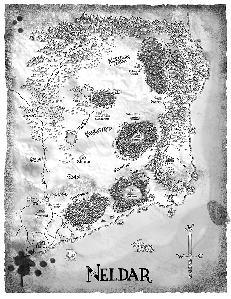
Maps are an important part of world-building in SFF, especially in epic fantasy, and often authors will have pretty in-depth maps sketched out for themselves while writing the books. It’s also really interesting for readers to be able to see and navigate the maps along with the story, so at Orbit we try to include maps as often as they are available, and useful to the story. Of course, we need an artist to take the author’s sketches and notes and scribbles and turn them into a coherent map. It’s not just a art job, it’s also a seriously geek job. You need an artist that is really into figuring out the details and making everything work. It’s not uncommon for one of my map artists to discover that the geography needs extra definition (and in some cases, outright redesign) to get the pieces to work. In the case of David Dalglish’s Shadowdance series, the maps were already pretty detailed and included in David’s self-published versions. However, we really wanted to push them the extra mile, so I brought in illustrator and mapmaker Tim Paul.

I’ve known Tim Paul’s work as an illustrator for a while now, and actually had no idea he illustrated maps too. And then one geeky night at the Society of Illustrators (yes, such a place exists, and if you are a fan of illustration, SFF or otherwise, you should check it out if you’re in NYC. They also house the Museum of Comic and Cartoon Art) and we were having a super-geek conversation about D&D and how into being a Dungeon Master Tim was, how he made intricate maps and props for his campaigns. He had also started doing some map commissions for smaller publishers, and really enjoyed it. I literally hired him on the spot.

Neldar-Dalglish-TimPaul

Here’s a bit of process from him: (more…)

The Making of a Cover: Design Roughs

Welcome to the most in-depth, behind-the-scenes, play-by-play account of how a cover is born, from the point of view of the Art Department. We’re charting the conception and birth of the Shadowdance series by David Dalglish.

So far we have talked about the first real step of a book, Acquisitionand then what goes into Cover Briefing. Then we let our minds wander and collect inspiration and form Directions for the cover. Then we agreed on a Photographer and Illustrator. We’ve even found our hero, the Cover Model. And we found a Trampoline for him to do stunt work on safely. We decked him out in book-specific Costume & Props. We spent all day at our Photo Shoot. After receiving the Rough Cuts and narrowing down the images, it was time for the illustrator to get to work, and while he did, Kirk was already working on the Design Roughs.

Kirk Benshoff did the type design for the covers, so I’ll let him take it from here…

Once we’ve decided on what images we want Gene to work on, I need to figure the style of how Gene is going to retouch the images. I also need to work out the layout and type options. This stage of the process can get hectic as I’m trying to figure out more than one thing at one time, so I have a few balls I need juggle.

Especially with a first volume in a series, there are essentially four things needed to establish the look and feel for the cover:

  1. Image Treatment/Style
  2. Image Crop
  3. Layout
  4. Typography

Image Treatment/Style – In other words, we just shot pictures of Bryce as an assassin, but I need the pictures stylized or “Orbit-ize” if you will. We did talk about this in the early concept stages, but now we have images from the photo shoot. I want to explore variations of the initial concept or maybe even an entirely new idea if inspired just to make sure we are getting the look and feel we want. Do we want the final image to look high contrast like the movie poster for Ninja Assassin? Or HDR like the cover for The Heroes by Joe Abercrombie? Do we want the image styled monochromatic, black and white, bright or with a muted color palette? Keep in mind, this is the first book in the series and we can’t change the style later. So we want to be confident with the choice right from the start. Figuring this out is the first item I work on so I can give direction to Gene when I give him the specific photo’s to be retouched.

Here are some of the options I presented internally for the Image/Treatment Style. How did we want the background? How was the art going to be stylized? These are very rough so we can get a knee jerk reaction to a direction.

(more…)

The Making of a Cover: Rough Cuts

Welcome to the most in-depth, behind-the-scenes, play-by-play account of how a cover is born, from the point of view of the Art Department. We’re charting the conception and birth of the Shadowdance series by David Dalglish.

So far we have talked about the first real step of a book, Acquisitionand then what goes into Cover Briefing. Then we let our minds wander and collect inspiration and form Directions for the cover. Then we agreed on a Photographer and Illustrator. We’ve even found our hero, the Cover Model. And we found a Trampoline for him to do stunt work on safely. We decked him out in book-specific Costume & Props. We spent all day at our Photo Shoot. And then a few days later we got the Rough Cuts from the shoot.

Rough cuts are the raw images that the photographer shot, completely unedited. All the lighting tests and misfires are in there, so it’s a lot to go through. We were immediately thrilled at not only how much material we had to choose from, but also how amazing the quality of the images were. We knew we had way more than enough for six books. And I’ll let Kirk Benshoff tell you how he narrowed it down…

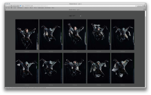
This is one of the most difficult and enjoyable parts of the process. Once the shoot was completed, I now have hundreds upon hundreds of pictures to comb through. In the days before digital, designers used to get contact/proof sheets from our photographers. A contact sheet is the process of developing film exactly the same size as the image on the negative. Contact sheets are ways to see entire rolls of film, so designers and editors can look at the shots and decide which images to use for the final project. Since the images are so small on a contact sheet, a loupe is used, which is a small magnifying lens to view the images in detail. Now with digital photography, we have programs that simulate the contact sheet for us on-screen.

One of the challenges back in those prehistoric days is we didn’t get our pictures right away. Shooting with film, you needed to wait a few days for the film to be developed, contact sheets made and finally shipped to your office. With digital photography, that wait time was virtually eliminated. In most cases I can leave a shoot with a hard drive of all the photographs. With the Shadowdance project, Michael Frost sent us a link to a special website he uses that acts as a virtual contact sheet. A hard drive with our high res images came the next day.

MIchaelFrost

Looking at the images can be overwhelming at first. But once you divide up the pictures, it can be easier to handle. We group all of them by  shots or pose and from there decide the best shot from each. Depending on how much post work/retouching you plan on doing, you may have images on the docket that you plan on taking elements from. For example, Image A is the best shot overall, but Image B the sword is in a better position and Image C The hood is sitting over the face nicer. So I’ll flag all of those shots and when I send everything to Gene Mollica, I’ll tell him about Image A, B, and C and he’ll do a new composite using the overall image from A but with the sword from B and the head/hood from C.

In the case of these Shadowdance covers, we needed to immediately decide what poses were going to be on the first three books. So I brought in the best examples of my favorite poses and showed them in our cover meeting. As a group, which included my Publisher Tim Holman, Editor Devi Pillai, Creative Director Lauren Panepinto, and Marketing Alex Lencicki, we all debated in detail on which pose we felt best suited each volume of the series. Once we picked the overall best poses, then we really looked in-depth at which facial expressions, arm poses, leg poses, weapon shots were the most dynamic. With the magic of Photoshop and digital compositing, we can pick and choose the best bits of many photos and make them work together.

Once we decided on these, I sent Gene a huge email with lots of information and waited for his initial roughs on compositing all the best parts together.


The Making of a Cover: Day of Shoot (plus video)

Welcome to the most in-depth, behind-the-scenes, play-by-play account of how a cover is born, from the point of view of the Art Department. We’re charting the conception and birth of the Shadowdance series by David Dalglish.

So far we have talked about the first real step of a book, Acquisitionand then what goes into Cover Briefing. Then we let our minds wander and collect inspiration and form Directions for the cover. Then we agreed on a Photographer and Illustrator. We’ve even found our hero, the Cover Model. And we found a Trampoline for him to do stunt work on safely. We decked him out in book-specific Costume & Props. And now it’s the day of the Photo Shoot!

Photo shoot days are stressful and exhausting—there’s always a ton of people to coordinate, and we were doing this shoot in a studio that wasn’t home base for anyone. We had to make sure everything was set up for stunts, and keep Bryce, or ninja, safe while he was flying around. On top of all of that, we were trying to shoot enough material for six covers at once! Never mind we also had a two-man video team taking all the behind-the-scenes footage. Photo shoots always go like this: Over-caffeination high, anxiety, concern that nothing is getting together on time, then you start shooting and it’s not quite there…then everything clicks into place and it’s magic. Watch the awesome video below and you’ll get a feel for how good it feel when everything starts going right:

Art Director Kirk Benshoff on the day of the shoot: (more…)

The Making of a Cover: Costume & Props (plus video)

SAMSUNG DIGITAL CAMERAWelcome to the most in-depth, behind-the-scenes, play-by-play account of how a cover is born, from the point of view of the Art Department. We’re charting the conception and birth of the Shadowdance series by David Dalglish.

So far we have talked about the first real step of a book, Acquisitionand then what goes into Cover Briefing. Then we let our minds wander and collect inspiration and form Directions for the cover. Then we agree on a Photographer and Illustrator. We’ve even found our hero, the Cover Model. And we found a Trampoline for him to do stunt work on safely. Now, to outfit him in the proper Costume & Props.

First, we have a fantastic video clip from the day of the photo shoot talking about all the props and costuming…

Our illustrator, Gene Mollica, is an expert when it comes to pulling together the necessary costuming and weapons. He has a great number of artists he works with to either adapt or create custom details, and he really geeks out on it. But first, Art Director Kirk Benshoff had to figure out exactly what these special cloaks were all about…

While I was hunting down a location for the photo shoot and finalizing the logistics with Bryce, I needed to get a costume ready as well. I figured David wasn’t going to be to keen on Haern dressed in an all black sweat suit with a couple inflatable swords for the cover. So I needed to work with our illustrator Gene Mollica to get all the details sorted out on the styling.

But before I go into that, let me tell you a little bit about Gene. Gene is awesome. Gene was that kid who loved fantasy so much as a kid, he never let it go as he got older. You talk to Gene about a project like this and you can feel his enthusiasm over the phone. As an art director, I get even more stoked about the project as I feed off his eagerness.  I gave Gene the details about everything and you can hear his brain running a mile a minute brainstorming about what we can/should/MUST do. Another amazing thing about Gene is he has an arsenal of weapons and props to contribute, either made or modified. I’ve been trying to talk him into letting me use his stuff for Halloween but he been (understandably) hesitant. :)

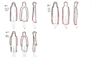
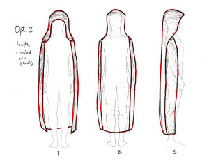
One of the first things I felt was really important was Haern’s three-piece cloak. Even though there was going to be a lot going on in the pictures, I wanted the cloak to be as accurate as possible. I worked up a few options that I ended up running past David to get his feedback:

Cloak Options
Cloak Options

After talking, David settled on Option #2 which was then sent to Gene and his costume designer.

FinalCloakSketch
Final Cloak Sketch

Gene and I needed to work out other details on the cloak as well. What was the color going to be? What kind of fabric did we want to use? Different fabrics can look very distinct once they’re photographed. Also, how was the fabric going to flow with the floor fans once Bryce started running with the cloak on? We want a strong image as a foundation so we can add drama and badass-ness later.

Over the course of the next few weeks we went back and fourth on changes and edits to the final cloak.

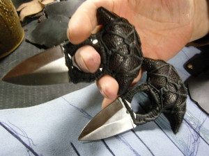
Haern was also going to be rocking armor as well. While the Cloak was being made, Gene was getting the leather chest plate, gauntlets, knives, throwing stars, and swords all made. Each piece meticulously put together by hand in amazing detail!

Once all the pieces to the costume were done, we were ready for the shoot and the biggest challenge of my career… finding an available day in everyone’s calendar to schedule the photo shoot. ;)