How to create a fantasy book cover: The making of the new-look Terry Brooks
 Do you ever wonder what goes into producing the cover artwork for some of the biggest fantasy books out there?
We asked the highly talented illustrator Stephen Youll about how he created the cover artwork for WARDS OF FAERIE (UK |ANZ), the first book in Terry Brooks’s brand new Dark Legacy of Shannara series – out next week on 23rd August.
We wanted a fresh new look for this series – both to appeal to Terry’s die-hard fans and to show that it’s a great point for new readers to get on board with the Terry Brooks phenomenon.
We were delighted with this artwork Stephen produced, so here, in his words, is how it came together:
For Terry Brooks’s first book in the new Dark Legacy series I was asked to create a dragon skull, hanging in a stone alcove with interesting lighting that gave the cover a rich and bold look to it that was different to everything else that was out there. Not much of a challenge?
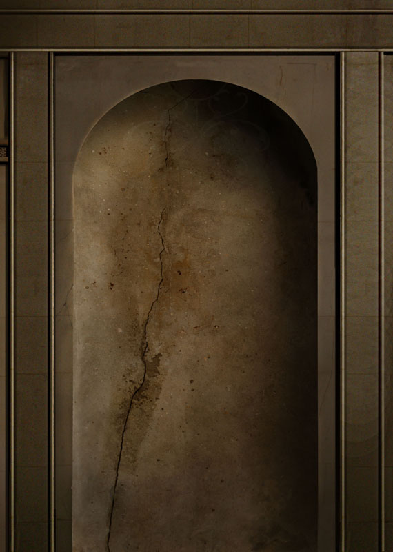
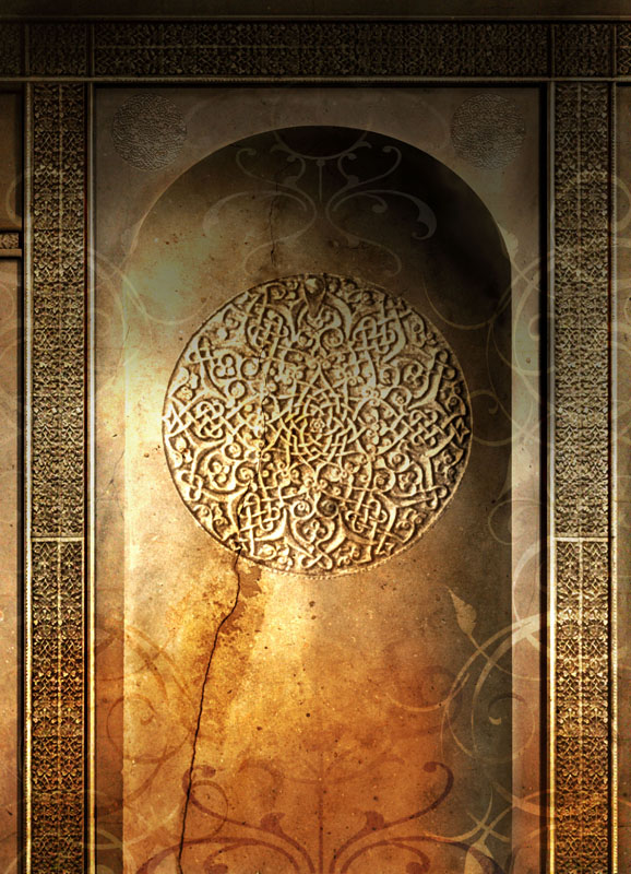
Step 1: This involves the creation of the alcove shape in the wall. I quickly established the arched alcove with light and shadows on top of a stone textured background.
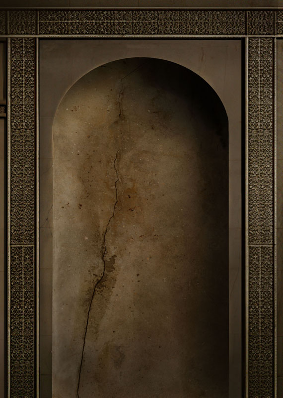
Step 2: I added the detailed panels from texture cloned from an old door and colored it to match the stone.
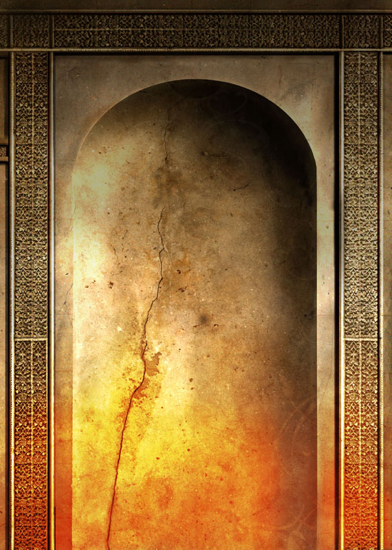
Step 3: I created layers of color and light overlays to give the alcove more dimension and character.
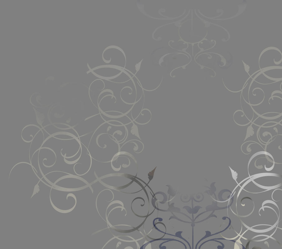
Step 4: I wanted a decorative design to superimpose over the alcove to give the cover more detail and ornamentation. So I created this intricate curly shaped pattern that later is screened over the art to give it a kind of transparent look. The design is created in white against black, and when the layer mode is set to screen, the background colors will tint the curly shapes, giving the design more dimension and texture.
Step 5: I’ve added the curly design over the art and added circular motifs to enhance the design to give the dragon skull something to rest against.
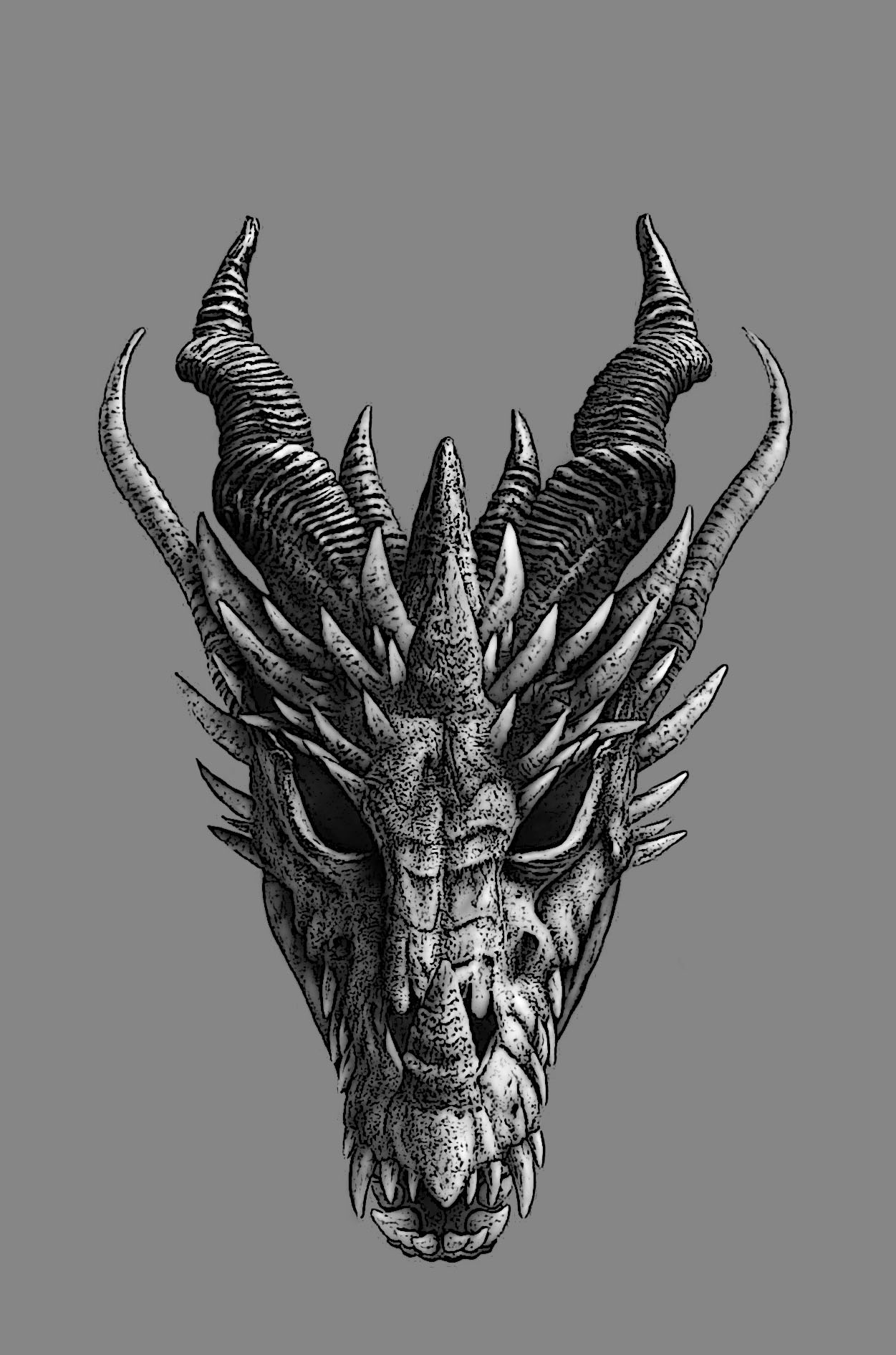
Step 6: My sketch of the dragon skull.
Step 7: Here I have started to paint and color the skull to match up with the lighting that’s on the alcove wall . . . Originally I created a darker and older looking skull to give it an ancient look.
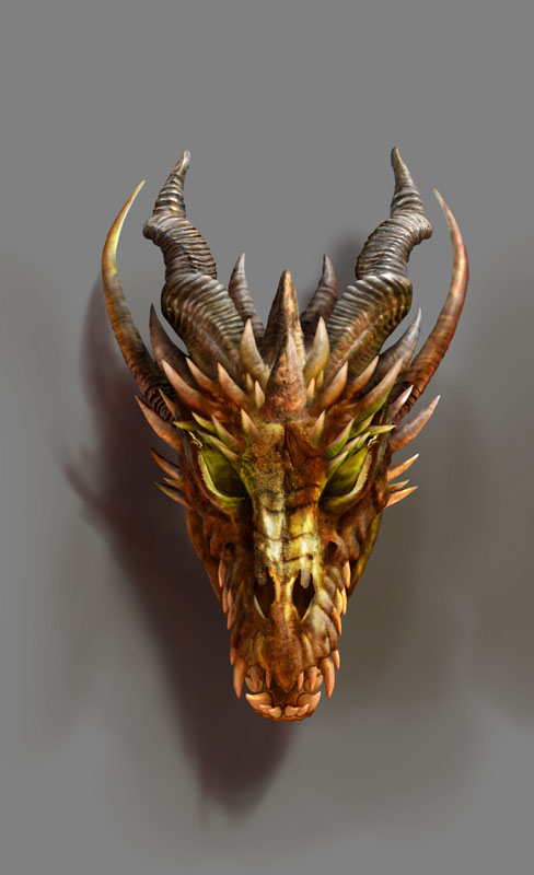
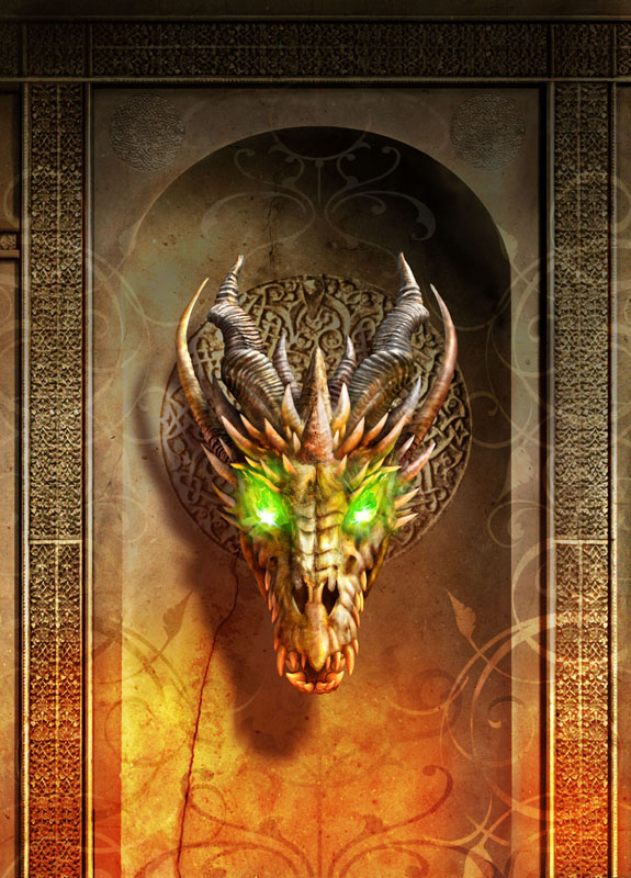
Step 8: Originally I was asked to put green Elfstones in the dragon’s eye sockets. This idea was abandoned later for a cleaner and simpler look.
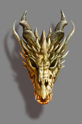
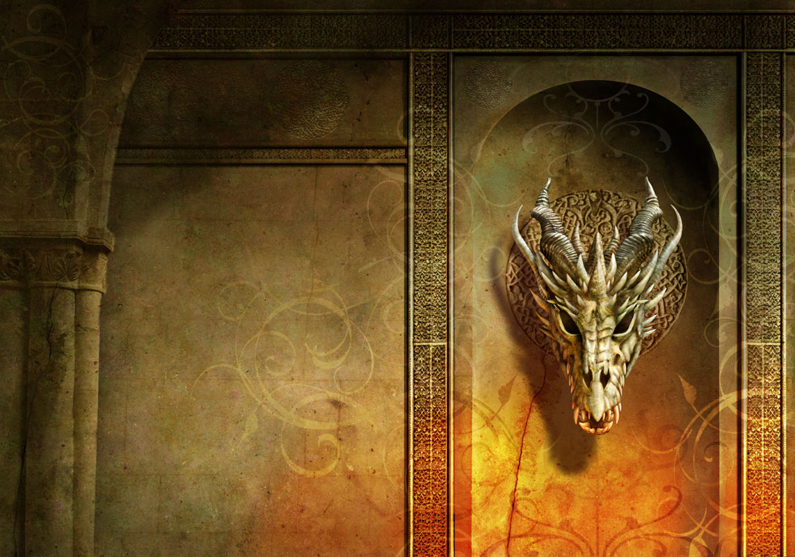
Step 9: This is the final skull design. It has a cleaner and whiter look to it – not so dirty looking and old.
Step 10: This is almost the final stage with a slightly warmer colored skull and the Elfstones in the eye sockets still. I added the shadow from the skull that will make the skull appear more dimensional.
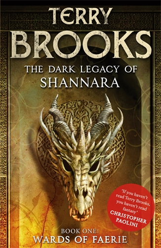
Step 11: The final cover art has the cleaner whiter skull without the Elfstones and a back cover extension with more of those curly designs and a stone pillar to add extra dimension to the wall.
The Dark Legacy of Shannara Book One: Wards of Faerie (UK |ANZ) is released on 23rd August 2012. In the words of Christopher Paolini: “If you haven’t read Terry Brooks, you haven’t read fantasy”

