Excuse Me While I Drool.
 Oh, I am a very happy camper. Would you like to know why? Shall I tell you? Indeed I shall. This is why: my amazing, fantabulous wonderful designers at Orbit have sent me the cover art for The Rebel Prince: Book Three of the Moorehawke Trilogy. So, I now have all three covers to smile over and stroke fondly, and call my very own.
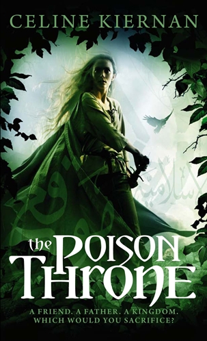
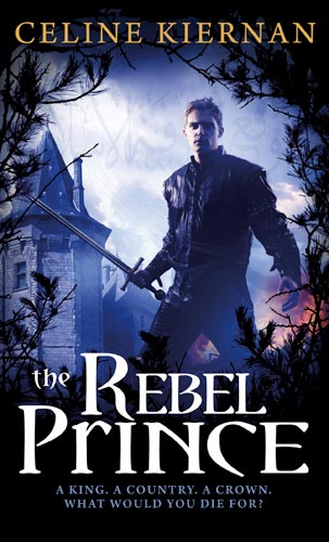
I must say I. LOVE. THESE. COVERS. I love everything about them. I love Steve Stone’s wonderful art work – in particular that fact that he didn’t just pick a generic fantasy boy and girl for the first and last covers but actually made them look like Wynter and Alberon ( Not having read The Rebel Prince, he even went to the trouble of contacting me to ask what Alberon looked like!) Steve’s artwork rocks. Go! Now! Run to his website and check out all the great covers he’s done. I love how designer Peter Cotton has incorporated a vital element of the story into each cover. For example:



I also love all the little design touches that Peter and Steve follow through on each cover. Like these, the lovely wreathed Ravens that are placed on each spine (I use birds symbolically throughout the trilogy). Touches like this – along with the illustrations under the blurbs: the ghosted ‘Arabic’ script and the framing of each character in foliage – flow from cover to cover, to give a sense of unity and cohesion to the three books.
And finally I love that each cover has its own colour scheme. Somehow the palates seems to perfectly suit the very different stories they illustrate: the cool greens of the first reflect the suppressed emotions of The Poison Throne; the reds and oranges of the second convey the frenzied violence of The Crowded Shadows, and somehow the third palette reminds me of armour and gunmetal – the cold, hard colours of the instruments of war. Wonderful work. Just wonderful. Thank you Peter and Steve!
